Use case #04: Visual experience
Open and reproducible analysis of light exposure and visual experience data (Advanced)
Johannes Zauner 
1 Preface
Wearable devices can capture more besides illuminance or melanopic EDI. They can capture many aspects of the visual environment that, from an observer’s perspective, form the visual experience. In this use case we focus on a multimodal dataset, captured by the VEET device1. It simultaneously captures from different sensors to collect light (ambient light sensor ALS), viewing distance (time of flight TOF), spectral information (spectral light channels, PHO), and motion and orientation (inertial measurements IMU). The data we are looking at do not come from a specific experiment, but are pilot data captured by an individual participant. The example is adapted from the online tutorial by Zauner et al. (2025).
The tutorial focuses on
import multimodal data
reconstruction of a spectral power distribution from sensor data
calculating spectrum-based metrics
simplifying a spatial grid of distance measurements
detecting clusters of conditions (for distance)
2 How this page works
This document runs a self‑contained version of R completely in your browser2. No setup or installation is required.
As soon as as webR has finished loading in the background, the Run Code button on code cells will become available. You can change the code and execute it either by clicking Run Code or by hitting CTRL+Enter (Windows) or CMD+Enter (MacOS). Some code lines have commments below. These indicate code-cell line numbers
NoteIf this is your first course tutorial
You can execute the same script in a traditional R environment, but this browser‑based approach has several advantages:
- You can get started in seconds, avoiding configuration differences across machines and getting to the interesting part quickly.
- Unlike a static tutorial, you can modify code to test the effects of different arguments and functions and receive immediate feedback.
- Because everything runs locally in your browser, there are no additional server‑side security risks and minimal network‑related slowdowns.
This approach also comes with a few drawbacks:
- R and all required packages are loaded every time you load the page. If you close the page or navigate elsewhere in the same tab, webR must be re‑initialized and your session state is lost.
- Certain functions do not behave as they would in a traditional runtime. For example, saving plot images directly to your local machine (e.g., with
ggsave()) is not supported. If you need these capabilities, run the static version of the script on your local R installation. In most cases, however, you can interact with the code as you would locally. Known cases where webR does not produce the desired output are marked specifically in this script and static images of outputs are displayed. - After running a command for more than 30 seconds, each code cell will go into a time out. If that happens on your browser, try reducing the complexity of commands or choose the local installation.
- Depending on your browser and system settings, functionality or output may differ. Common differences include default fonts and occasional plot background colors. If you encounter an issue, please describe it in detail—along with your system information (hardware, OS, browser)—in the issues section of the GitHub repository. This helps us to improve your experience moving forward.
3 Setup
We start by loading the necessary packages.
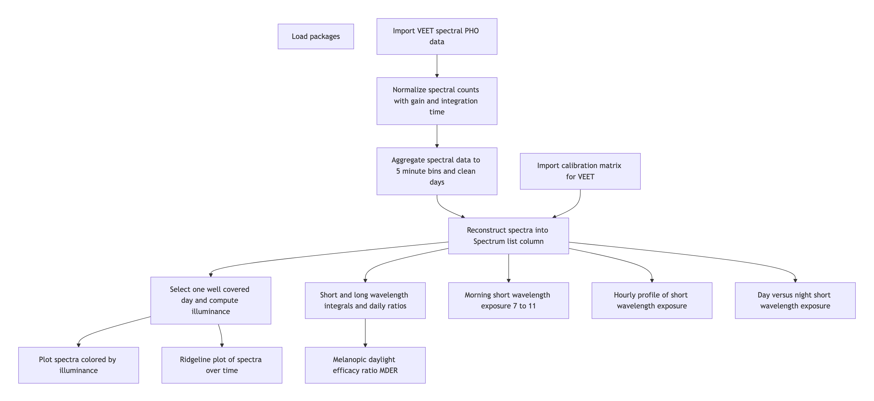
4 Spectrum
4.1 Import
The VEET device records multiple data modalities in one combined file. Its raw data file contains interleaved records for different sensor types, distinguished by a “modality” field. Here we focus first on the spectral sensor modality (PHO) for spectral irradiance data, and below under Section 5.1 the time-of-flight modality (TOF) for distance data.
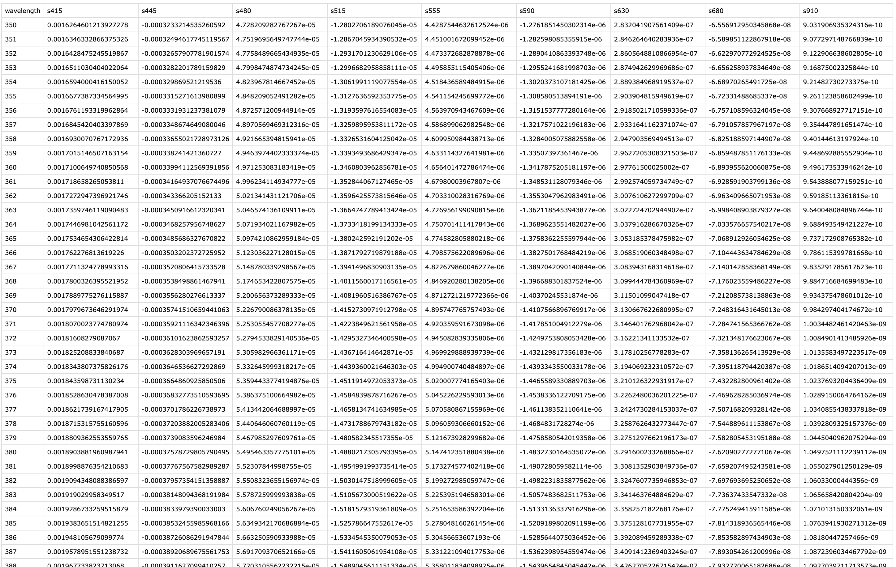
In the VEET’s export file, each line includes a timestamp and a modality code, followed by fields specific to that modality. Importantly, this means that the VEET export is not rectangular, i.e., tabular. The non-rectangular structure of the VEET files can be seen in Figure 2. This makes it challenging for many import functions that expect the equal number of columns in every row, which is not the case in this instance. For the PHO (spectral) modality, the columns include a timestamp, integration time, a general Gain factor, and nine sensor channel readings covering different wavelengths (with names like s415, s445, ..., s680, s940) as well as a Dark channel and a broadband channels Clear. In essence, the VEET’s spectral sensor captures light in several wavelength bands (from ~415 nm up to 940 nm, plus an infrared and “clear” channel) rather than outputting a single lux value like the ambient light sensor does (PHO). Unlike illuminance, the spectral data are not directly given as directly interpretable radiometric metrics but rather as raw sensor counts across multiple wavelength channels, which require conversion to reconstruct a spectral power distribution. In our analysis, spectral data allow us to compute metrics like the relative contribution of short-wavelength (blue) light versus long-wavelength light in the participant’s environment. Processing this spectral data involves several necessary steps.
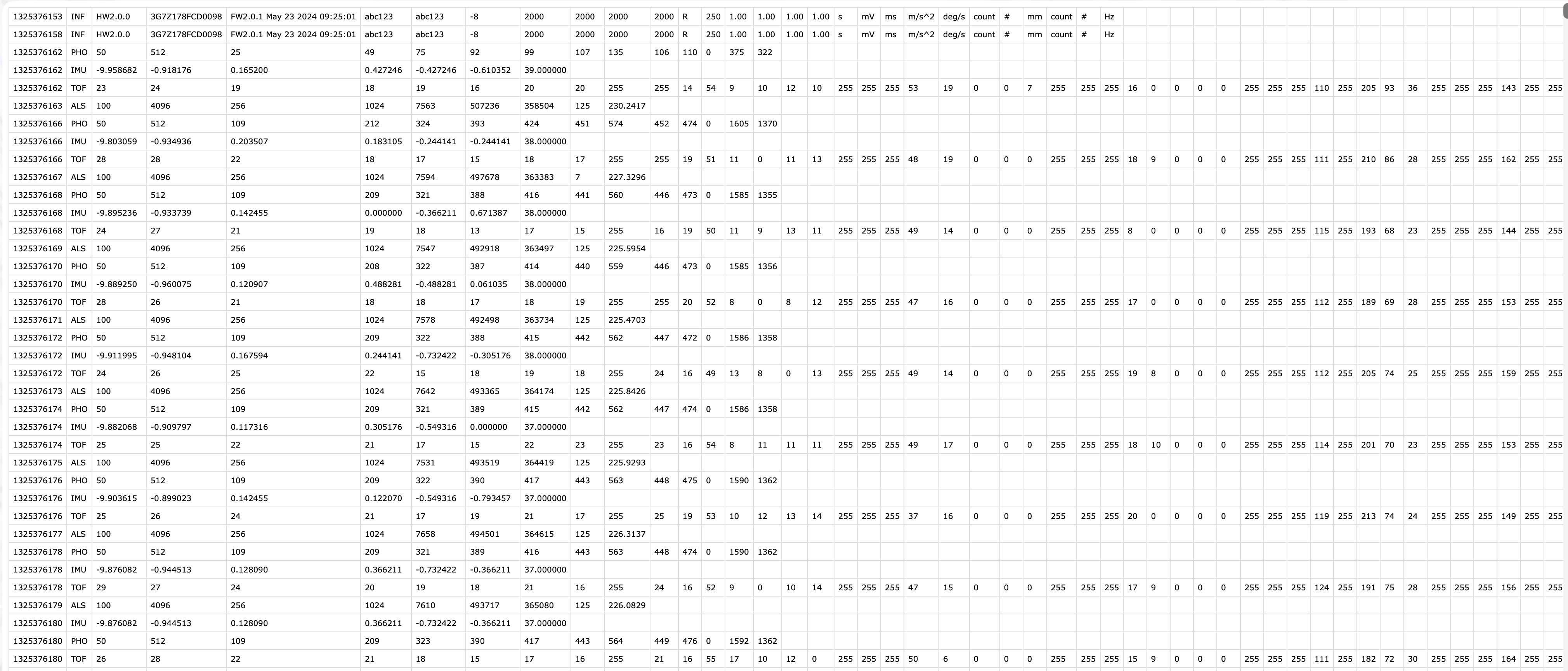
VEET file format
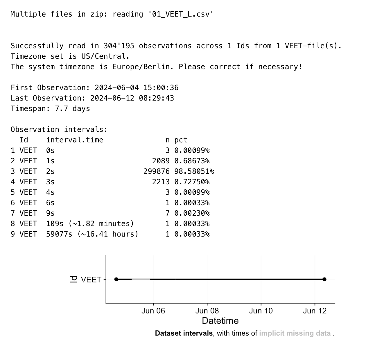
To import the VEET ambient light data, we use the LightLogR import function, specifying the PHO modality. The raw VEET data in our example is provided as a zip file (02_VEET_L.csv.zip) containing the logged data for about four days. Because webR struggles with loading .zip resources, we download the data after the fact from GitHub:
modalityis a parameter only theVEETdevice requires. If uncertain, which devices require special parameters, have a look a the import help page (?import) under theVEETdevice. Setting it toPHOgives us the spectral modality.As we are only dealing with one individual here, we set a manual
IdIn
LightLogR 0.10.0 High noon, which is the current version as this use case was written, this argument would not be necessary, as it is the default version. Things might change, however in the future. Setting this version argument ensures that the file will be read in correctly, even if the default file format evolves over time.
To check which version is available for a device (and what the default version is that is called when nothing is provided), check the following function.
After import, data contains columns for the timestamp (Datetime), Gain (the sensor gain setting), and the nine spectral sensor channels plus a clear channel. These appear as numeric columns named s415, s445, ..., s940, Dark, Clear. Other columns are also present but not needed for now. The spectral sensor was logging at a 2-second rate. It is informative to look at a snippet of the imported spectral data before further processing. The following table shows three rows of data after import (before calibration), with some technical columns omitted for brevity:
4.2 Spectral calibration
Now we proceed with spectral calibration. The VEET’s spectral sensor counts need to be converted to physical units (spectral irradiance) via a calibration matrix provided by the manufacturer. For this example, we assume we have a calibration matrix that maps all the channel readings to an estimated spectral power distribution (SPD). The LightLogR package provides a function spectral_reconstruction() to perform this conversion. However, before applying it, we must ensure the sensor counts are in a normalized form. This procedure is laid out by the manufacturer. In our version, we refer to the VEET SPD Reconstruction Guide.pdf, version 06/05/2025. Note that each manufacturer has to specify the method of count normalization (if any) and spectral reconstruction. In our raw data, each observation comes with a Gain setting that indicates how the sensor’s sensitivity was adjusted; we need to divide the raw counts by the gain to get normalized counts. LightLogR offers normalize_counts() for this purpose. We further need to scale by integration time (in milliseconds) and adjust depending on counts in the Dark sensor channel.
1-2. Column names of variables that need to be normalized
4-9. Gain ratios as specified by the manufacturer’s reconstruction guide
Remove dark counts & scale by integration time
Function to normalize counts
All sensor channels share the gain value
Sensor channels to normalize (see prior code cell above)
Gain ratios (see prior code cell above)
10-11. Drop original raw count columns
In this call, we specified gain.columns = rep("Gain", 11) because we have 11 sensor columns that all use the same gain factor column (Gain). This step will add new columns (with a suffix, e.g. .normalized) for each spectral channel representing the count normalized by the gain. We then dropped the raw count columns and renamed the normalized ones by dropping .normalized from the names. After this, data contains the normalized sensor readings for s415, s445, ..., s940, Dark, Clear for each 5-minute time point.
Because we do not need this high a resolution, we will aggregate it to a 5-minute interval for computational efficiency. The assumption is that spectral composition does not need to be examined at every 2-second instant for our purposes, and 5-minute averages can capture the general trends while drastically reducing data size and downstream computational costs.
Group the data by calendar day
Remove days (i.e., groups) with less than 23 hours of available data. By setting the
threshold.missingto a negative number, we enforce minimum duration, which is great when the total duration of a group is not known or varies.show how many days are left
We use one of the channels (here Clear) as the reference variable for remove_partial_data to drop incomplete days (the choice of channel is arbitrary as all channels share the same level of completeness). The dataset is now ready for spectral reconstruction.
Warning
Please be aware that normalize_counts() requires the Gain values according to the gain table. If we had aggregated the data before normalizing it, Gain values would have been averaged within each bin (5 minutes in this case). If the Gain did not change in that time, it is not an issue. Any mix of Gain values will lead to a Gain value that is not represented in the gain table. While outputs for normalize_counts() are not wrong in these cases, they will output NA if a Gain value is not found in the table. Thus we recommend to always normalize counts based on the raw dataset.
4.3 Spectral reconstruction
For spectral reconstruction, we require a calibration matrix that corresponds to the VEET’s sensor channels. This matrix would typically be obtained from the device manufacturer or a calibration procedure. It defines how each channel’s normalized count relates to intensity at various wavelengths. For demonstration, the calibration matrix was provided by the manufacturer and is specific to the make and model (see Figure 3). It should not be used for research purposes without confirming its accuracy with the manufacturer.
2-5. Import the calibration matrix and make certain wavelength is set a rownames
The function
spectral_reconstruction()does not work on the level of the dataset, but has to be called withinmutate()(or provided the data directly)Pick the normalized sensor columns
Provide the calibration matrix
Return a long-form list column (wavelength, intensity)
Here, we use format = "long" so that the result for each observation is a list-column Spectrum, where each entry is a tibble 3 containing two columns: wavelength and irradiance (one row per wavelength in the calibration matrix). In other words, each row of data now holds a full reconstructed spectrum in the Spectrum column. The long format is convenient for further calculations and plotting. (An alternative format = "wide" would add each wavelength as a separate column, but that is less practical when there are many wavelengths.)
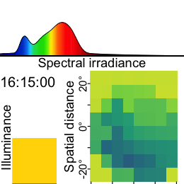
To visualize the data we will calculate the photopic illuminance based on the spectra and plot each spectrum color-scaled by their illuminance. For clarity, we reduce the data to observations within the day that has the most observations (non-NA).
Keep only observations for one day (with the lowest missing intervals)
Use the spectrum,…
… call the function
spectral_integration()for each,…… use the brightness sensitivity function,…
… and apply the appropriate efficacy weight.
Create a long format of the data where the spectrum is unnested
The following plot visualizes the spectra:
The following ridgeline plot can be used to assess when in the day certain spectral wavelenghts are dominant:
At this stage, the data dataset has been processed to yield time-series of spectral power distributions. We can use these to compute biologically relevant light metrics. For instance, one possible metric is the proportion of power in short wavelengths versus long wavelengths.
With the VEET spectral preprocessing complete, we emphasize that these steps – normalizing by gain, applying calibration, and perhaps simplifying channels – are device-specific requirements. They ensure that the raw sensor counts are translated into meaningful physical measures (like spectral irradiance). Researchers using other spectral devices would follow a similar procedure, adjusting for their device’s particulars (some may output spectra directly, whereas others, like VEET, require reconstruction.
Note
Some devices may output normalized counts instead of raw counts. For example, the ActLumus device outputs normalized counts, while the VEET device records raw counts and the gain. Manufacturers will be able to specify exact outputs for a given model and software version.
4.4 Metrics
Note
Spectrum-based metrics in wearable data are relatively new and less established compared to distance or broadband light metrics. The following examples illustrate potential uses of spectral data in a theoretical sense, which can be adapted as needed for specific research questions.
4.4.1 Ratio of short- vs. long-wavelength light
Our first spectral metric is the ratio of short-wavelength light to long-wavelength light, which is relevant, for example, in assessing the blue-light content of exposure. For this example, we will arbitrarily define “short” wavelengths as 400–500 nm and “long” as 600–700 nm. Using the list-column of spectra in our dataset, we integrate each spectrum over these ranges (using spectral_integration()), and then compute the ratio short/long for each time interval. We then summarize these ratios per day.
- Focus on ID, date, time, and spectrum
5-6. Integrate over the spectrum from 400 to 500 nm
7-8. Integrate over the spectrum from 600 to 700 nm
The following table shows the average short/long wavelength ratio, averaged over each day (and then as weekday/weekend means if applicable). In this dataset, the values give an indication of the spectral balance of the light the individual was exposed to (higher values mean relatively more short-wavelength content).
4.4.2 Melanopic daylight efficacy ratio (MDER)
The same idea is behind calculating the melanopic daylight efficacy ratio (or MDER), which is defined as the melanopic EDI divided by the photopic illuminance. Results are shown in the following table. In this case, instead of a simple integration over a wavelength band, we apply an action spectrum to the spectral power distribution (SPD), integrate over the weighted SPD, and apply a correction factor. All of this is implemented in spectral_integration().
- Calculate melanopic EDI by applying the \(s_{mel (\lambda)}\) action spectrum, integrating, and weighing
- Calculate photopic illuminance by applying the \(V_{(\lambda)}\) action spectrum, integrating, and weighing
4.4.3 Short-wavelength light at specific times of day
The second spectral example examines short-wavelength light exposure as a function of time of day. Certain studies might be interested in, for instance, blue-light exposure during midday versus morning or night. We demonstrate three approaches: (a) filtering the data to a specific local time window, and (b) aggregating by hour of day to see a daily profile of short-wavelength exposure. Additionally, we (c) look at differences between day and night periods.
This code cell isolates the time window between 7:00 and 11:00 each day and computes the average short-wavelength irradiance in that interval. This represents a straightforward query: “How much blue light does the subject get in the morning on average?”
- Filter data to local 7am–11am
To visualize short-wavelength exposure over the course of a day, we aggregate the data into hourly bins. We cut the timeline into 1-hour segments (using local time), compute the mean short-wavelength irradiance in each hour for each day. The following figure shows the resulting diurnal profile, with short-wavelength exposure expressed as a fraction of the daily maximum for easier comparison.
Bin timestamps by hour
Add a Time column (hour of day, based on the cut/rounded data)
Finally, we compare short-wavelength exposure during daytime vs. nighttime. Using civil dawn and dusk information (based on geographic coordinates, here set for Houston, TX, USA), we label each measurement as day or night and then compute the total short-wavelength exposure in each period. The following table summarizes the daily short-wavelength dose received during the day vs. during the night.
- Coordinates for Houston, Texas, USA
4-5. Adding and grouping by photoperiod
5 Distance
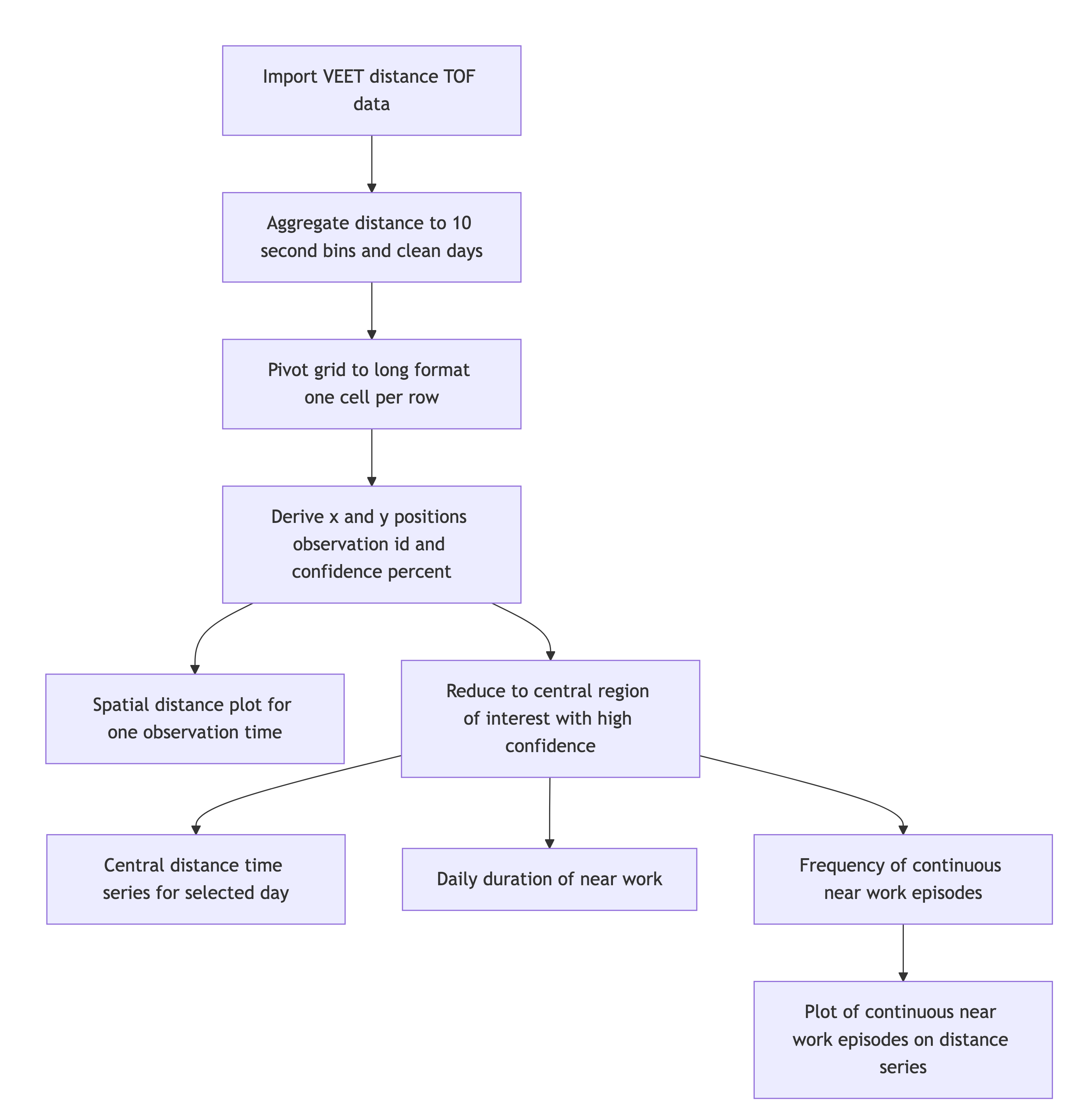
5.1 Import
In this second section, the distance data of the VEET device will be imported, analogous to the other modality. The TOF modality contains information for up to two objects in a 8x8 grid of measurements, spanning a total of about 52° vertically and 41° horizontally. Because the VEET device can detect up to two objects in a given grid point, and there is a confidence value assigned to every measurement, each observation contains \(2*2*8*8 = 256\) measurements.
Note
Due to the 2-second collection interval across over 7 days, the dataset is to large to be imported in the live tutorial. Thus, a preprocessed version that was produced by the static tutorial is used from three code cells downwards on.
modalityis a parameter only theVEETdevice requires. If uncertain, which devices require special parameters, have a look a the import help page (?import) under theVEETdevice. Setting it toTOFgives us the distance modality.As we are only dealing with one individual here, we set a manual
IdThis file was captured with an older
VEETfirmware. Thus we setversion = "initial", so it reads it correctly.
In a first step, we condition the data similarly to the other VEET modality. For computational reasons of the use cases, we remove the second object and set the interval to 10 seconds.
Remove the second object (for computational reasons)
Aggregate to 10-second bins
Explicit NA for any gaps
The resulting dataset is small enough that we can continue in the live session. The following code cell will import the dataset
In the next step, we need to transform the wide format of the imported dataset into a long format, where each row contains exactly one observation for one grid-point.
In a final step before we can use the data in the analysis, we need to assign x and y coordinates based on the position column that was created when pivoting longer. Positions are counted from 0 to 63 starting at the top right and increasing towards the left, before continuing on the right in the next row below. y positions thus depend on the row count, i.e., how often a row of 8 values fits into the position column. x positions consequently depend on the position within each 8-value row. We also add an observation variable that increases by +1 every time, the position column hits 0. We then center both x and y coordinates to receive meaningful values, i.e., 0° indicates the center of the overall measurement cone.
Lastly, we convert both confidence columns, which are scaled from 0-255 into percentages by dividing them by 255. Empirical data from the manufacturer points to a threshold of about 10%, under which the respective distance data is not reliable.
- Increment the y position for every 8 steps in
position - Center
y.posand rescale it to cover 52° across 8 steps - Increment the x position for every step in
position, resetting every 8 steps - Center
x.posand rescale it to cover 41° across 8 steps - Increase an observation counter every time we restart with
positionat 0 - Scale the confidence columns so that 255 = 100%
Now this dataset is ready for further analysis. We finish by visualizing the same observation time on different days. Note that we replace zero distance values with Infinity, as these indicate measurements outside the 5m measurement radius of the device.
1-12. Set visualization parameters
- Allows to choose an observation
Choose a particular observation
Replace 0 distances with Infinity
Remove data that has less than 10% confidence
Plot the data
Show one plot per day
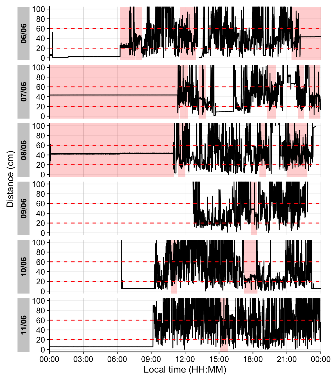
As we can see from the figure, different days have - at a given time - a vastly different distribution of distance data, and measurement confidence (values with confidence < 10% are removed)
5.2 Distance with spatial distribution
Some devices output a singular measure for distance (e.g., the Clouclip). The visual environment in natural conditions contains many distances, depending on the solid angle and direction of the measurement. A device like the VEET increases the spatial resolution of these measurements, allowing for more in-depth analyses of the size and position of an object within the field of view. In the case of the VEET, data are collected from an 8x8 measurement grid, spanning 52° vertically and 41° horizontally.
There are many ways how a spatially resolved distance measure could be utilized for analysis:
- Where in the field of view are objects in close range
- How large are near objects in the field of view
- How varied are distances within the field of view
- How close are objects / is viewing distance in a region of interest within the field of view
In view of the scope of these use cases, we will focus on the last point, but all aspects could be tackled with the available data. As these are still time-series data, the change of these aspects over time is also a relevant aspect.
5.3 Distance in a region of interest
We will reduce the dataset to (high confidence) values at or around a given grid position, e.g., ±10 degrees around the central view (0°).
3 & 10. Group by every observation. While this grouping is dropped in the next step it is crucial to derive at one value per time point (and Id).
4-6. Remove data with low confidence, and outside ±10° in x and y direction
Calculate central distance
Number of (valid) grid points
Filter one day
Create 15 minute data
Remove midnight data points
5-12. Setting up the plot for distance. It is a nice example showcasing the many sensible defaults gg_day() has for light variables, compared to other modalities
5.4 Distance-based metrics
The following distance-based metrics use LightLogR functions to derive at the results. They can be mapped broadly 1:1 to light metrics, provided that thresholds are adjusted for light.
5.4.1 Daily duration of near work
Consider only distances in [10, 60) cm
Total duration in that range per day
Can be used to check the weekday types
Summary across weekday and weekend
5.4.2 Frequency of continuous near work
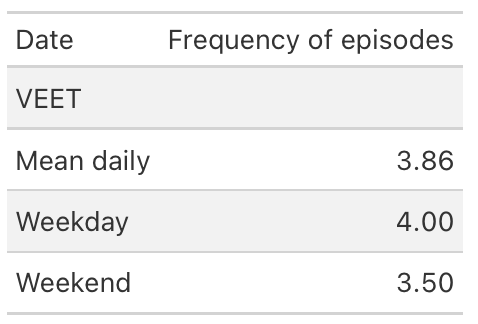
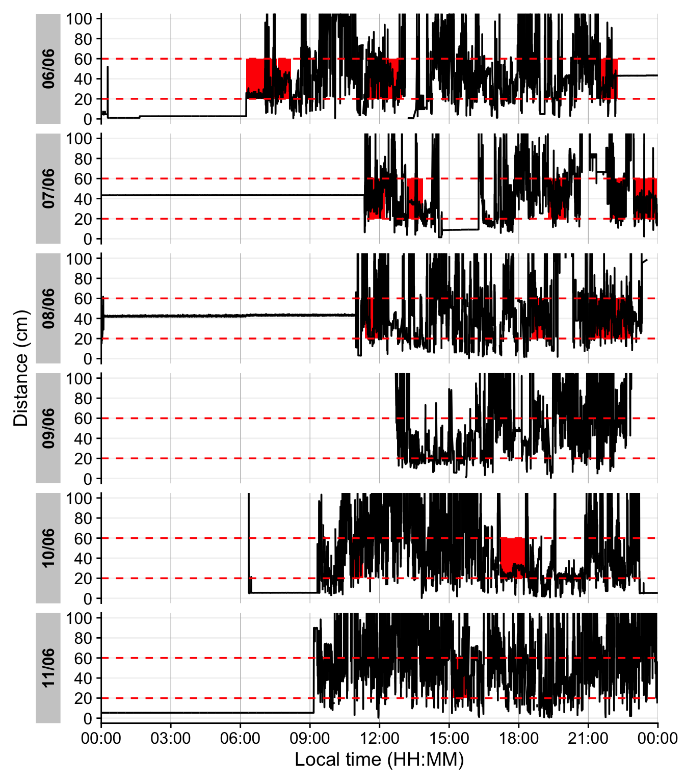
Continuous near-work is typically defined as sustained viewing within a near distance for some minimum duration, allowing only brief interruptions. We use LightLogR’s cluster function to identify episodes of continuous near work. Here we define a near-work episode as viewing distance between 20 cm and 60 cm that lasts at least 30 minutes, with interruptions of up to 1 minute allowed (meaning short breaks ≤1 min do not end the episode). Using extract_clusters() with those parameters, we count how many such episodes occur per day.
The following table summarizes the average frequency of continuous near-work episodes per day, and the following figure provides an example visualization of these episodes on the distance time series.
Note
The family of cluster functions do not work with the live tutorials. Please use the static variant for calculation.
Condition: near-work distance
Minimum duration of a continuous episode
Maximum gap allowed within an episode
Keep days with zero episodes in output
8-9. Count number of episodes per day
- Compute daily mean frequency
1-6. This function does not extract the clusters from the dataset, but rather annotates the dataset.
- Add state bands
The last figure showcases a serious issue. During the nighttime, when the device is not worn, it records distance values in the area of interest. To get rid of these values, we remove times with low variance, based on a sliding window of 10 minutes. Let us first determine what such a value would look like.
4-6. This function from the {slider} package apply a function on a sliding window (the standard deviation in our case). As we are working with 10-second data, we set the window size to 2x30, to look at 10 minute windows.
- Try different values to check how the threshold affects the outcome.
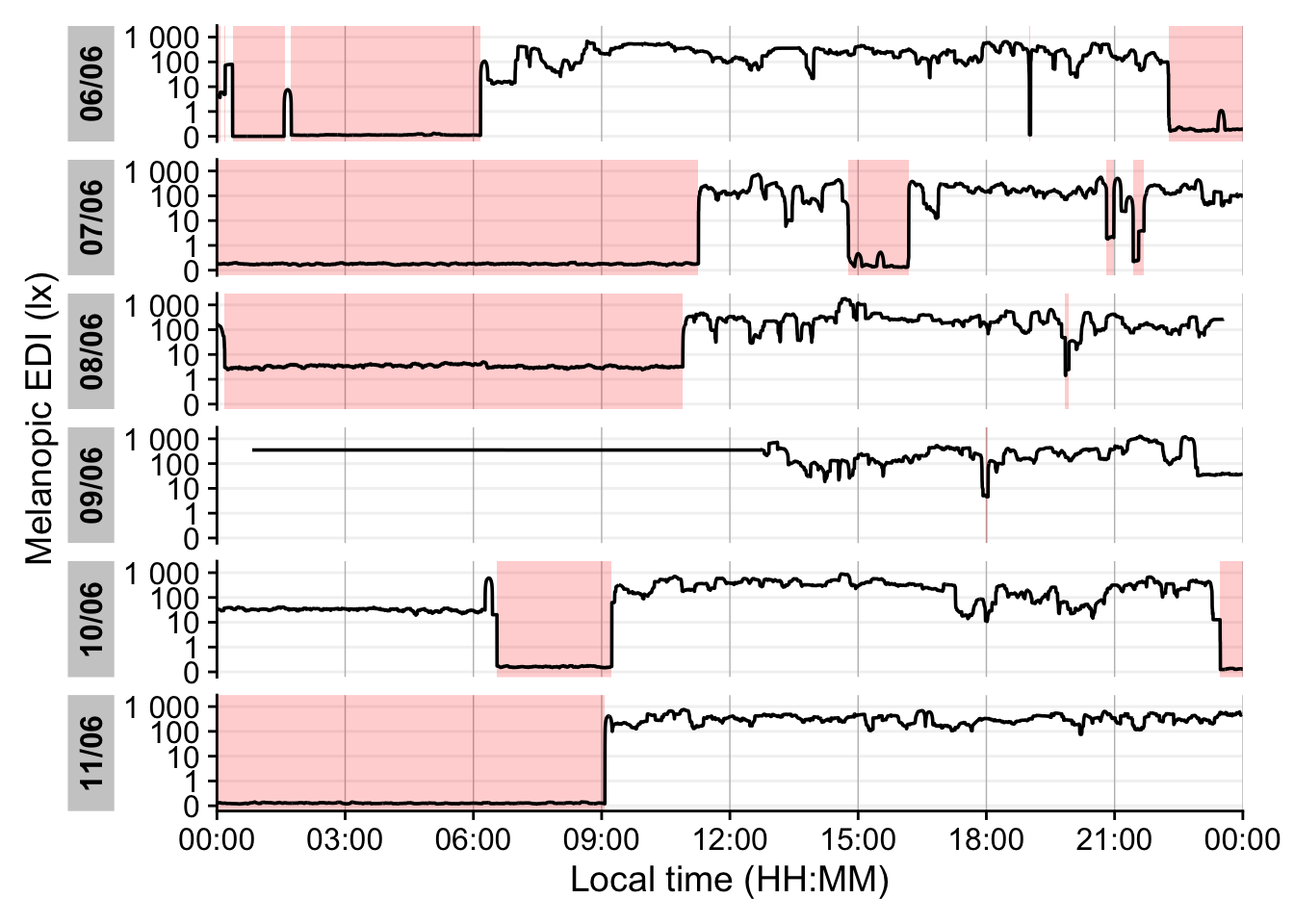
Looking at the data, a threshold value of 5 for the dist_sdlooks sensible. We will not consider these values moving forward.
additionally checking that it is not a time point with suspiciously low variation
Setting the height and opacity of the state-bar.
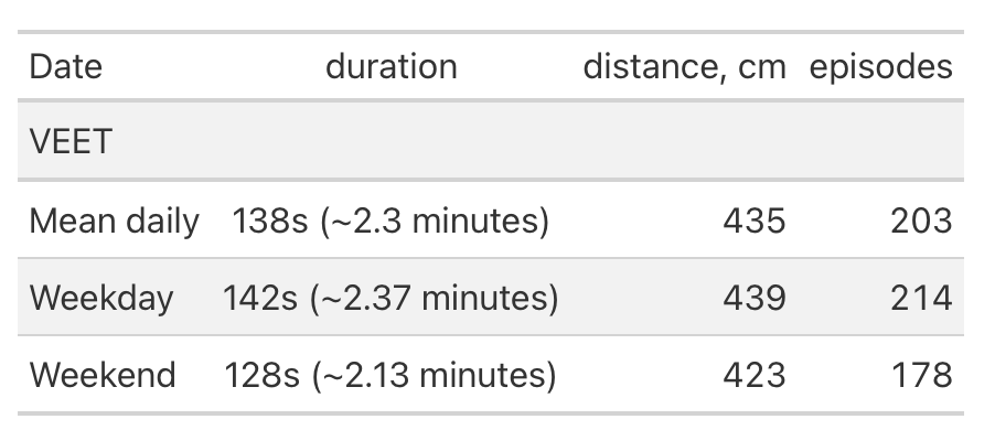
5.4.3 Near-work episodes
Beyond frequency, we can characterize near-work episodes by their duration and typical viewing distance. This section extracts all near-work episodes (using a shorter minimum duration to capture more routine near-work bouts) and summarizes three aspects: (1) frequency (count of episodes per day), (2) average duration of episodes, and (3) average distance during those episodes. These results are combined in the following table.
Minimal duration to count as an episode (very short to capture all)
Calculate mean distance during each episode
Daily averages for each metric
6 Conclusion
Congratulations! You have finished this section of the advanced course. If you go back to the homepage, you can select one of the other use cases.
Footnotes
If you want to know more about
webRand theQuarto-liveextension that powers this document, you can visit the documentation page↩︎tibble are data.tables with tweaked behavior, ideal for a tidy analysis workflow. For more information, visit the documentation page for tibbles↩︎