You are tasked with visualizing a day of light logger data, worn by a participant over the course of one week. You´re supposed to show the data in comparison with what is available outside in unobstructed daylight. And, to make matters slightly more complex, you also want to show how the participant´s luminous exposure compares to the current recommendations of healthy daytime, evening, and nighttime light exporsure. While the figure is nothing special in itself, working with light logger data to get the data ready for plotting is fraught with many hurdles, beginning with various raw data structures depending on the device manufacturer, varying temporal resolutions, implicit missing data, irregular data, working with Datetimes, and so forth. LightLogR aims to make this process easier by providing a holistic workflow for the data from import over validation up to and including figure generation and metric calculation.
This article guides you through the process of
importing Light Logger data from a participant as well as the environment, and sleep data about the same participant
creating exploratory visualizations to select a good day for the figure
connecting the datasets to a coherent whole and setting recommended light levels based on the sleep data
creating an appealing visualization with various styles to finish the task
Let´s head right in by loading the package! We will also work a bit
with data manipulation, display the odd table, and enroll the help of
several plotting aids from the ggplot2 package, so we will
also need the tidyverse and the gt package.
Later on, we want to combine plots, this is where patchwork
will come in. The here package is used to make sure that
the paths to the data are correct.
Please note that this article uses the base pipe operator
|>. You need an R version equal to or greater than 4.1.0 to use it. If you are using an older version, you can replace it with themagrittrpipe operator%>%.
Importing Data
The data we need are part of the LightLogR package. They
are unprocessed (after device export) data from light loggers (and a
diary app for capturing sleep times). All data is anonymous, and we can
access it through the following paths:
path <- system.file("extdata",
              package = "LightLogR")

file.LL <- "205_actlumus_Log_1020_20230904101707532.txt.zip"
file.env <- "cyepiamb_CW35_Log_1431_20230904081953614.txt.zip"
file.sleep <- "205_sleepdiary_all_20230904.csv"
Participant Light Logger Data
LightLogR provides convenient import functions for a
range of supported devices (use the command
supported_devices() if you want to see what devices are
supported at present). Because LightLogR knows how the
files from these devices are structured, it needs very little input. In
fact, the mere filepath would suffice. It is, however, a good idea to
also provide the timezone argument tz to specify that these
measurements were made in the Europe/Berlin timezone. This
makes your data future-proof for when it is used in comparison with
other geolocations.
Every light logger dataset needs an Id to connect or
separate observations from the same or different
participant/device/study/etc. If we don´t provide an Id to
the import function (or the dataset doesn´t contain an Id
column), the filename will be used as an Id. As this would
be rather cumbersome in our case, we will use a regex to
extract the first three digits from the filename, which serve this
purpose here.
tz <- "Europe/Berlin"
dataset.LL <- import$ActLumus(file.LL, path, auto.id = "^(\\d{3})", tz = tz)
#> Multiple files in zip: reading '205_actlumus_Log_1020_20230904101707532.txt'
#>
#> Successfully read in 61'016 observations across 1 Ids from 1 ActLumus-file(s).
#> Timezone set is Europe/Berlin.
#> The system timezone is UTC. Please correct if necessary!
#>
#> First Observation: 2023-08-28 08:47:54
#> Last Observation: 2023-09-04 10:17:04
#> Timespan: 7.1 days
#>
#> Observation intervals:
#>   Id    interval.time     n pct
#> 1 205   10s           61015 100%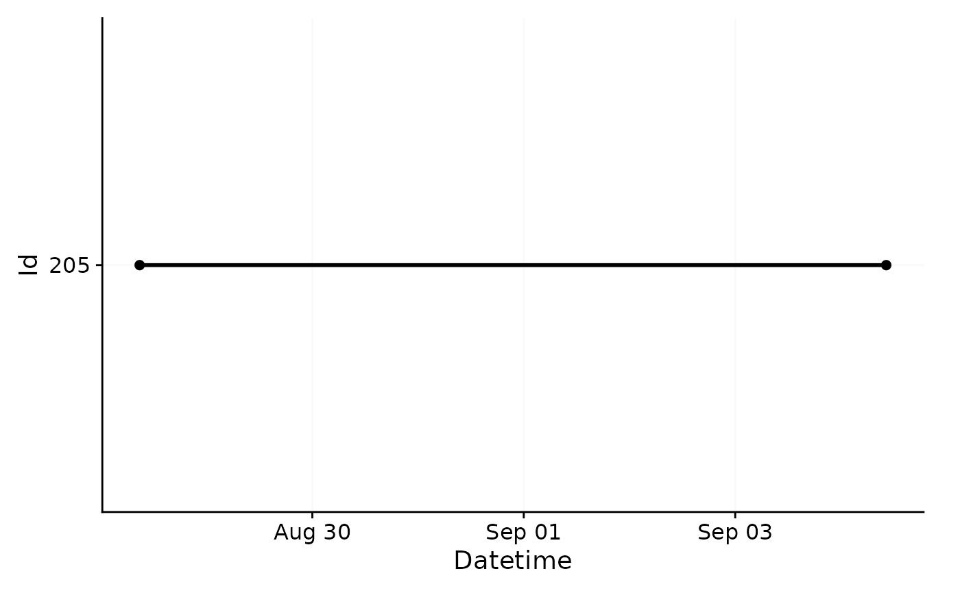
As you can see, the import is accompanied by a (hopefully) helpful
message about the imported data. It contains the number ob measurements,
the timezone, start- and enddate, the timespan, and all observation
intervals. In this case, the measurements all follow a 10
second epoch. We also get a plotted overview of the data. In our
case, this is not particularly helpful, but quickly helps to assess how
different datasets compare to one another on the timeline. We could
deactivate this plot by setting auto.plot = FALSE during
import, or create it separately with the gg_overview()
function.
Because we have no missing values that we would have to deal with first, this dataset is already good to go. If you, e.g., want to know the range of melanopic EDI (a measure of stimulus strength for the nonvisual system) for every day in the dataset, you can do that:
dataset.LL |>
  group_by(Date = as_date(Datetime)) |>
  summarize(
    range.MEDI = range(MEDI) |> str_flatten(" - ")
    ) |>
gt()| Date | range.MEDI |
|---|---|
| 2023-08-28 | 0 - 10647.22 |
| 2023-08-29 | 0 - 7591.5 |
| 2023-08-30 | 0 - 10863.57 |
| 2023-08-31 | 0 - 10057.08 |
| 2023-09-01 | 0 - 67272.17 |
| 2023-09-02 | 0 - 106835.71 |
| 2023-09-03 | 0 - 57757.9 |
| 2023-09-04 | 0 - 64323.52 |
Same goes for visualization - it is always helpful to get a good look
at data immediately after import. The gg_day() function
creates a simple ggplot of the data, stacked vertically by
Days. The function needs very little input beyond the dataset (in fact,
it would even work without the size input, which just makes
the default point size smaller, and the interactive command
sends the output to plotly to facilitate data exploration).
gg_day() features a lot of flexibility, and can be adapted
and extended to fit various needs, as we will see shortly.
dataset.LL |> gg_day(size = 0.25, interactive = TRUE)We can already see some patterns and features in the luminous exposure across the days. In general, the participant seems to have woken (or at least started wearing the light logger) after 9:00 and went to bed (or, again, stopped wearing the device) at around 23:00.
Environmental Light Data
On to our next dataset. This one contains measurement data from the
same type of device, but recorded on a rooftop position of unobstructed
daylight in roughly the same location as the participant data. As the
device type is the same, import is the same as well. But since the
filename does not contain the participant´s ID this time,
we will give it a manual id: "CW35".
dataset.env <- import$ActLumus(file.env, path, manual.id = "CW35", tz = tz)
#> Multiple files in zip: reading 'cyepiamb_CW35_Log_1431_20230904081953614.txt'
#>
#> Successfully read in 20'143 observations across 1 Ids from 1 ActLumus-file(s).
#> Timezone set is Europe/Berlin.
#> The system timezone is UTC. Please correct if necessary!
#>
#> First Observation: 2023-08-28 08:28:39
#> Last Observation: 2023-09-04 08:19:38
#> Timespan: 7 days
#>
#> Observation intervals:
#>   Id    interval.time     n pct
#> 1 CW35  29s               1 0%
#> 2 CW35  30s           20141 100%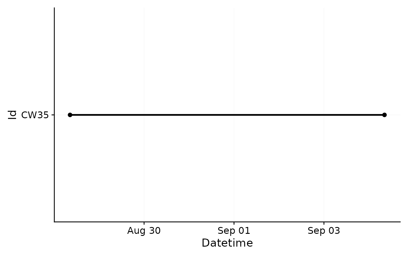
Here you can see that we follow roughly the same time span, but the measurement epoch is 30 seconds, with one odd interval which is one second shorter.
Participant Sleep Data
Our last dataset is a sleep diary that contains, among other things,
a column for Id and a column for sleep and for
wake (called offset). Because sleep diaries and other
event datasets can vary widely in their structure, we must manually set
a few arguments. Importantly, we need to specify how the Datetimes are
structured. In this case, we have values like 28-08-2023 23:20,
which give a structure of dmyHM.
What we need after import is a coherent table that contains a column
with a Datetime besides a column with the
State that starts at that point in time.
import_Statechanges() facilitates this, because we can
provide a vector of column names that form a continuous
indicator of a given state - in this case Sleep.
dataset.sleep <-
  import_Statechanges(file.sleep, path,
                      Datetime.format = "dmyHM",
                      State.colnames = c("sleep", "offset"),
                      State.encoding = c("sleep", "wake"),
                      Id.colname = record_id,
                      sep = ";",
                      dec = ",",
                      tz = tz)
#>
#> Successfully read in 14 observations across 1 Ids from 1 Statechanges-file(s).
#> Timezone set is Europe/Berlin.
#> The system timezone is UTC. Please correct if necessary!
#>
#> First Observation: 2023-08-28 23:20:00
#> Last Observation: 2023-09-04 07:25:00
#> Timespan: 6.3 days
#>
#> Observation intervals:
#>    Id    interval.time             n pct
#>  1 205   34860s (~9.68 hours)      1 8%
#>  2 205   35520s (~9.87 hours)      1 8%
#>  3 205   35700s (~9.92 hours)      1 8%
#>  4 205   36000s (~10 hours)        1 8%
#>  5 205   36900s (~10.25 hours)     1 8%
#>  6 205   37020s (~10.28 hours)     1 8%
#>  7 205   37920s (~10.53 hours)     1 8%
#>  8 205   45780s (~12.72 hours)     1 8%
#>  9 205   48480s (~13.47 hours)     1 8%
#> 10 205   49200s (~13.67 hours)     1 8%
#> # ℹ 3 more rows

dataset.sleep |>
  head() |>
gt()| State | Datetime |
|---|---|
| 205 | |
| sleep | 2023-08-28 23:20:00 |
| wake | 2023-08-29 09:37:00 |
| sleep | 2023-08-29 23:40:00 |
| wake | 2023-08-30 09:21:00 |
| sleep | 2023-08-30 23:15:00 |
| wake | 2023-08-31 09:47:00 |
Now that we have imported all of our data, we need to combine it sensibly, which we will get to in the next section.
Connecting Data
Connecting the data, in this case, means giving context to our participant’s luminous exposure data. There are a number of hurdles attached to connecting time series data, because data from different sets rarely align perfectly. Often their measurements are off by at least some seconds, or even use different measurement epochs.
Also, we have the sleep data, which only has time stamps whenever
there is a change in status. Also - and this is crucial - it might have
missing entries! LightLogR provides a few helpful functions
however, to deal with these topics without resorting to rounding or
averaging data to a common multiple.
Solar Potential
Let us start with the environmental measurements of unobstructed daylight. These can be seen as a natural potential of luminous exposure and thus serve as a reference for our participant´s luminous exposure.
With the data2reference() function, we will create this
reference. This function is extraordinarily powerful in that it can
create a reference tailored to the light logger data from any source
that has the wanted Reference column (in this case the MEDI
column, which is the default), a Datetime column, and the
same grouping structure (Id) as the light logger data
set.
data2reference() can even create a reference from a
subset of the data itself. For example this makes it possible to have
the first (or second, etc.) day of the data as reference for all other
days. It can further apply one participant as the reference for all
other participants, even when their measurements are on different times.
In our case it is only necessary to specify the argument
across.id = TRUE, as we want the reference
Id(“CW35”) to be applied across the Id from
the participant (“205”).
dataset.LL <-
  dataset.LL |>
    data2reference(Reference.data = dataset.env, across.id = TRUE)

dataset.LL <-
  dataset.LL |>
    select(Id, Datetime, MEDI, Reference)

dataset.LL |>
  head() |>
gt()| Datetime | MEDI | Reference |
|---|---|---|
| 205 | ||
| 2023-08-28 08:47:54 | 0.77 | 403.32 |
| 2023-08-28 08:48:04 | 2.33 | 403.32 |
| 2023-08-28 08:48:14 | 5.63 | 403.32 |
| 2023-08-28 08:48:24 | 6.03 | 454.96 |
| 2023-08-28 08:48:34 | 5.86 | 454.96 |
| 2023-08-28 08:48:44 | 6.04 | 454.96 |
For the sake of this example, we have also removed unnecessary data columns, which makes the further code examples simpler. We can already see in the table above that the reference at the start of the measurements is quite a bit higher than the luminous exposure at the participant´s light logger. We also see that the same reference value is applied to three participant values. This mirrors the fact that for every three measurements taken with the participant device, one measurement epoch for the environmental sensor passes.
To visualize this newly reached reference data, we can easily extend
gg_day() with a dashed red reference line. Keep in mind
that this visualization is still exploratory, so we are not investing
heavily in styling.
dataset.LL |>
  gg_day(size = 0.25) +
  geom_line(aes(y=Reference), lty = 2, col = "red")
#> Warning: Removed 707 rows containing missing values or values outside the scale range
#> (`geom_line()`).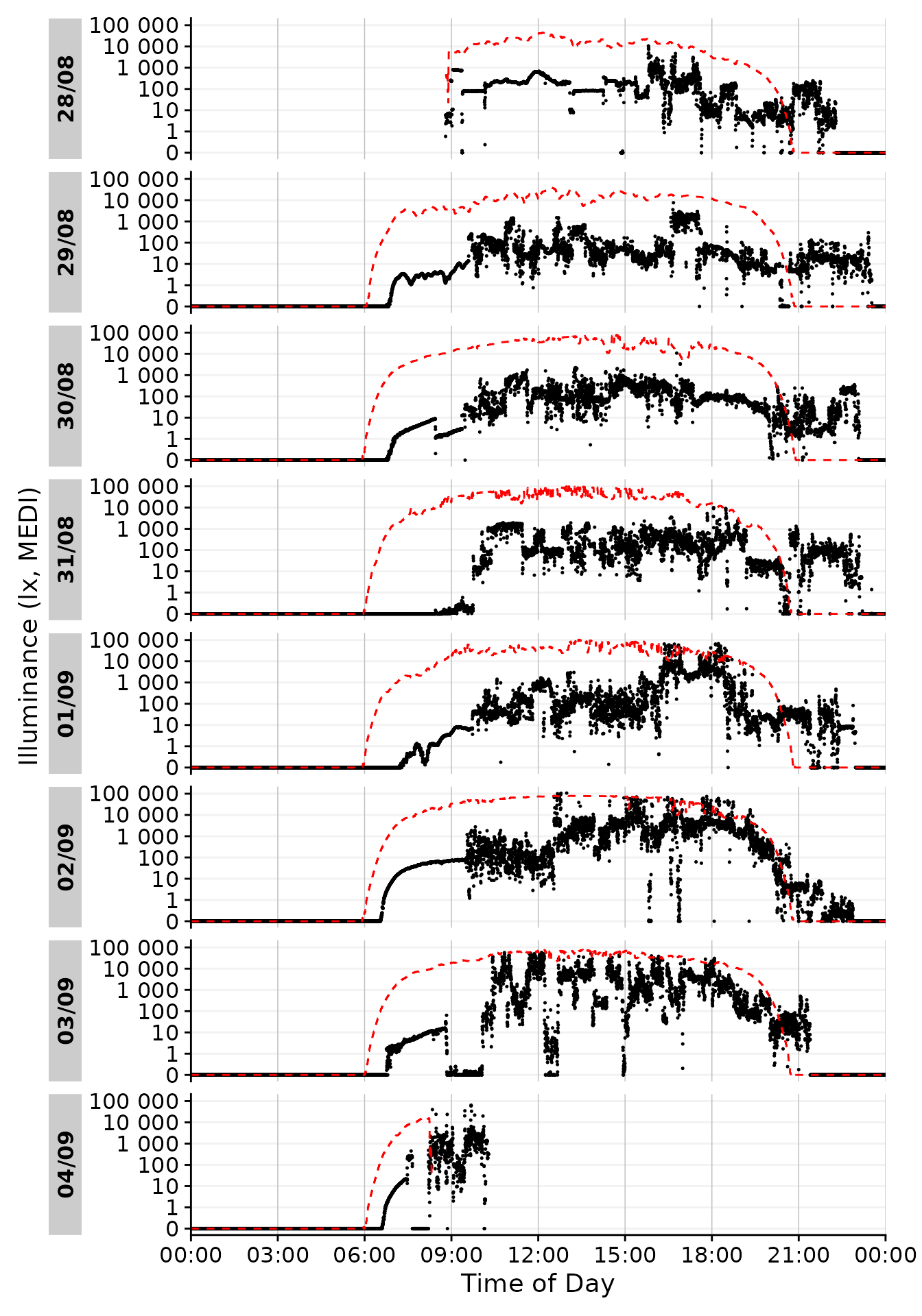
Here, a warning about missing values was added. This is simply due to
the fact that not every data point on the x-axis has a corresponding
y-axis-value. The two datasets largely align, but at the fringes,
especially the last day, there is some non-overlap. When we perform
calculations based on the light logger data and the reference, we have
to keep in mind that only timesteps where both are present will
give non NA results.
While basic, the graph already shows valuable information about the potential light stimulus compared to actual exposure. In the morning hours, this participant never reached a significant light dose, while luminous exposure in the evening regularly was on par with daytime levels, especially on the 29th. Let us see how these measurements compare to recommendations for luminous exposure.
Recommended Light levels
Brown et al.(2022)1 provide guidance for healthy, daytime dependent light stimuli, measured in melanopic EDI:
Throughout the daytime, the recommended minimum melanopic EDI is 250 lux at the eye measured in the vertical plane at approximately 1.2 m height (i.e., vertical illuminance at eye level when seated). If available, daylight should be used in the first instance to meet these levels. If additional electric lighting is required, the polychromatic white light should ideally have a spectrum that, like natural daylight, is enriched in shorter wavelengths close to the peak of the melanopic action spectrum.
During the evening, starting at least 3 hours before bedtime, the recommended maximum melanopic EDI is 10 lux measured at the eye in the vertical plane approximately 1.2 m height. To help achieve this, where possible, the white light should have a spectrum depleted in short wavelengths close to the peak of the melanopic action spectrum.
The sleep environment should be as dark as possible. The recommended maximum ambient melanopic EDI is 1 lux measured at the eye. In case certain activities during the nighttime require vision, the recommended maximum melanopic EDI is 10 lux measured at the eye in the vertical plane at approximately 1.2 m height.
We can see that bedtime is an important factor when determining the
timepoints these three stages go into effect. Luckily we just so happen
to have the sleep/wake data from the sleep diary at hand. In a first
step, we will convert the timepoints where a state changes into
intervals during which the participant is awake or asleep. The
sc2interval() function provides this readily.
In our case the first entry is sleep, so we can safely assume, that
on that day prior the participant was awake. We could take this into
account through the starting.state = "wake" argument
setting, but then it would be implied that the participant was awake
from midnight on. As the first day of data is only partial anyways, we
will disregard this. There are other arguments to
sc2interval() to further refine the interval creation.
Probably the most important is length.restriction, that
sets the maximum length of an interval, the default being 24 hours. This
avoids implausibly long intervals with one state that is highly likely
caused by implicit missing data or misentries.
dataset.sleep <-
  dataset.sleep |>
  sc2interval()

dataset.sleep |>
  head() |>
gt()| State | Interval |
|---|---|
| 205 | |
| NA | 2023-08-28 00:00:00 CEST--2023-08-28 23:20:00 CEST |
| sleep | 2023-08-28 23:20:00 CEST--2023-08-29 09:37:00 CEST |
| wake | 2023-08-29 09:37:00 CEST--2023-08-29 23:40:00 CEST |
| sleep | 2023-08-29 23:40:00 CEST--2023-08-30 09:21:00 CEST |
| wake | 2023-08-30 09:21:00 CEST--2023-08-30 23:15:00 CEST |
| sleep | 2023-08-30 23:15:00 CEST--2023-08-31 09:47:00 CEST |
Now we can transform these sleep/wake intervals to intervals for the
Brown recommendations. The sleep_int2Brown() function
facilitates this.
Brown.intervals <-
  dataset.sleep |>
  sleep_int2Brown()
#> Adding missing grouping variables: `Id`

Brown.intervals |>
  head() |>
gt()| State.Brown | Interval |
|---|---|
| 205 | |
| NA | 2023-08-28 00:00:00 CEST--2023-08-28 20:20:00 CEST |
| evening | 2023-08-28 20:20:00 CEST--2023-08-28 23:20:00 CEST |
| night | 2023-08-28 23:20:00 CEST--2023-08-29 09:37:00 CEST |
| day | 2023-08-29 09:37:00 CEST--2023-08-29 20:40:00 CEST |
| evening | 2023-08-29 20:40:00 CEST--2023-08-29 23:40:00 CEST |
| night | 2023-08-29 23:40:00 CEST--2023-08-30 09:21:00 CEST |
We can see that the function fit a 3 hour interval in-between every
sleep and wake phase, and also recoded the states. This data can now be
applied to our light logger dataset. This is done through the
interval2state() function2. We already used this
function unknowingly, because it (alongside sc2interval())
is under the hood of data2reference(), making sure that
data in the reference set is spread out accordingly.
dataset.LL <-
  dataset.LL |>
    interval2state(
      State.interval.dataset = Brown.intervals, State.colname = State.Brown
      )

dataset.LL |>
  tail() |>
gt()| Datetime | MEDI | Reference | State.Brown |
|---|---|---|---|
| 205 | |||
| 2023-09-04 10:16:14 | 321.10 | NA | day |
| 2023-09-04 10:16:24 | 310.92 | NA | day |
| 2023-09-04 10:16:34 | 309.07 | NA | day |
| 2023-09-04 10:16:44 | 319.95 | NA | day |
| 2023-09-04 10:16:54 | 326.11 | NA | day |
| 2023-09-04 10:17:04 | 324.52 | NA | day |
Now we have a column in our light logger dataset that declares all
the three state for the Brown et al. recommendation. With another
function, Brown2reference(), we can in one swoop add the
threshhold accompanied to these states and check whether our participant
is within the recommendations or not. The only thing the function needs
is a name where to put the recommended values - by default these would
go to Reference, which is already used for the Solar
exposition, which is why we put it in Reference.Brown.
dataset.LL <-
  dataset.LL |>
    Brown2reference(Brown.rec.colname = Reference.Brown)

dataset.LL |>
  select(!Reference.Brown.label, !Reference.Brown.difference) |>
  tail() |>
gt()| Datetime | MEDI | Reference | State.Brown | Reference.Brown | Reference.Brown.check | Reference.Brown.difference | Reference.Brown.label |
|---|---|---|---|---|---|---|---|
| 205 | |||||||
| 2023-09-04 10:16:14 | 321.10 | NA | day | 250 | TRUE | 71.10 | Brown et al. (2022) |
| 2023-09-04 10:16:24 | 310.92 | NA | day | 250 | TRUE | 60.92 | Brown et al. (2022) |
| 2023-09-04 10:16:34 | 309.07 | NA | day | 250 | TRUE | 59.07 | Brown et al. (2022) |
| 2023-09-04 10:16:44 | 319.95 | NA | day | 250 | TRUE | 69.95 | Brown et al. (2022) |
| 2023-09-04 10:16:54 | 326.11 | NA | day | 250 | TRUE | 76.11 | Brown et al. (2022) |
| 2023-09-04 10:17:04 | 324.52 | NA | day | 250 | TRUE | 74.52 | Brown et al. (2022) |
Brown2reference() added four columns, two of which are
shown in the table above. A third column contains a text label about the
type of reference, sth. we could also have added for the solar
exposition and the fourth column contains the difference between actual
mel EDI and the recommendations. Now let´s have a quick look at the
result in the plot overview
dataset.LL |> #dataset
  gg_day(size = 0.25) + #base plot
  geom_line(aes(y=Reference), lty = 2, col = "red") + #solar reference
  geom_line(aes(y=Reference.Brown), lty = 2, col = "blue") #Brown reference
#> Warning: Removed 707 rows containing missing values or values outside the scale range
#> (`geom_line()`).
#> Warning: Removed 4153 rows containing missing values or values outside the scale range
#> (`geom_line()`).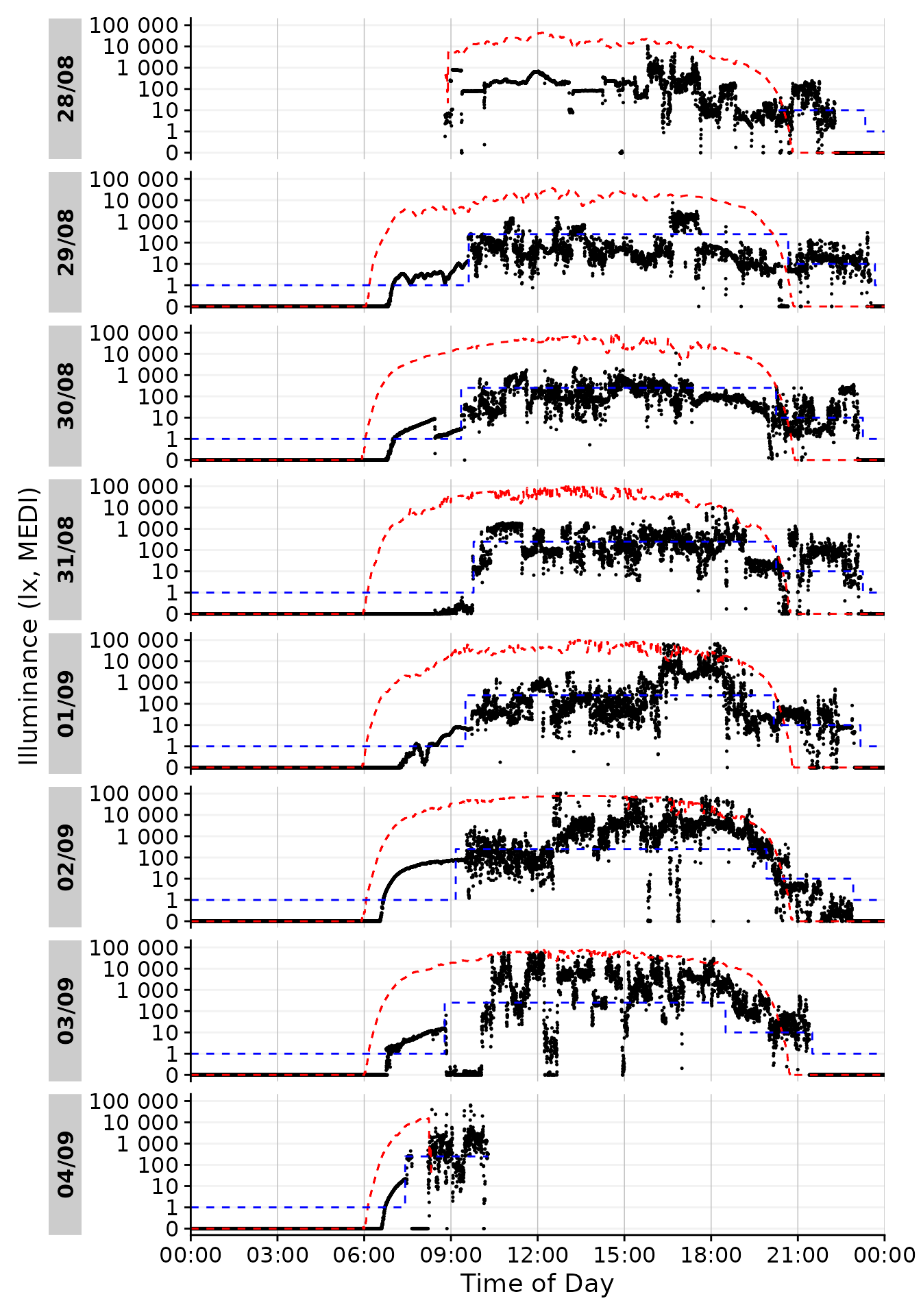
Looking good so far! In the next section, let us focus on picking out one day and get more into styling. Based on the available data I think 01/09 looks promising, as there is some variation during the day with some timeframes outside in the afternoon and a varied but typical luminous exposure in the evening.
We can use the filter_Date() function to easily cut this
specific chunk out from the data. We also deactivate the facetting
function from gg_day(), as we only have one day.
dataset.LL.partial <-
dataset.LL |> #dataset
  filter_Date(start = "2023-09-01", length = days(1)) #use only one day

solar.reference <- geom_line(aes(y=Reference), lty = 2, col = "red") #solar reference
brown.reference <- geom_line(aes(y=Reference.Brown), lty = 2, col = "blue") #Brown reference

dataset.LL.partial  |>
  gg_day(size = 0.25, facetting = FALSE, y.scale = symlog_trans()) + #base plot
  solar.reference + brown.reference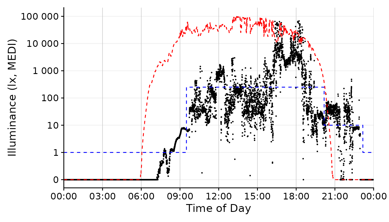
Styling Data
Let us finish our task by exploring some styling options for our
graph. All of these are built on the dataset we ended up with in the
last section. We had to use several functions as processing steps, but
it has to be noted that we rarely had to specify arguments in functions.
This is due to the workflow LightLogR provides start to
finish. Most of the techniques in this section are not specific to
LightLogR, but rather show that you can readily use data
processed with the package to work with standard plotting function.
Firstly, though, let us slightly tweak the y-axis.
scale.correction <- coord_cartesian(
  xlim = c(0, 24.5*60*60), #make sure the x axis covers 24 hours (+a bit for the label)
  expand = FALSE #set the axis limits exactly at ylim and xlim
  )
Participants luminous exposure
By default, gg_day() uses a point geom for the data
display. We can, however, play around with other geoms.
dataset.LL.partial  |>
  gg_day(
    size = 0.25, geom = "point", facetting = FALSE) + #base plot
  solar.reference +
  brown.reference +
  scale.correction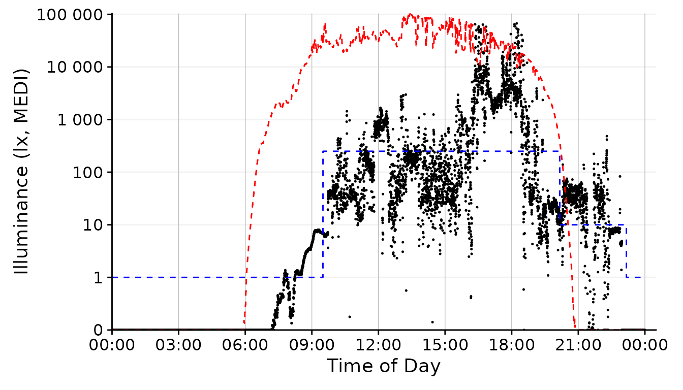
This is the standard behavior of gg_day(). We would not
have to specify the geom = "point" in this case, but being
verbose should communicate that we specify this argument.
dataset.LL.partial  |>
  gg_day(
    size = 0.25, facetting = FALSE, geom = "line") + #base plot
  solar.reference +
  brown.reference +
  scale.correction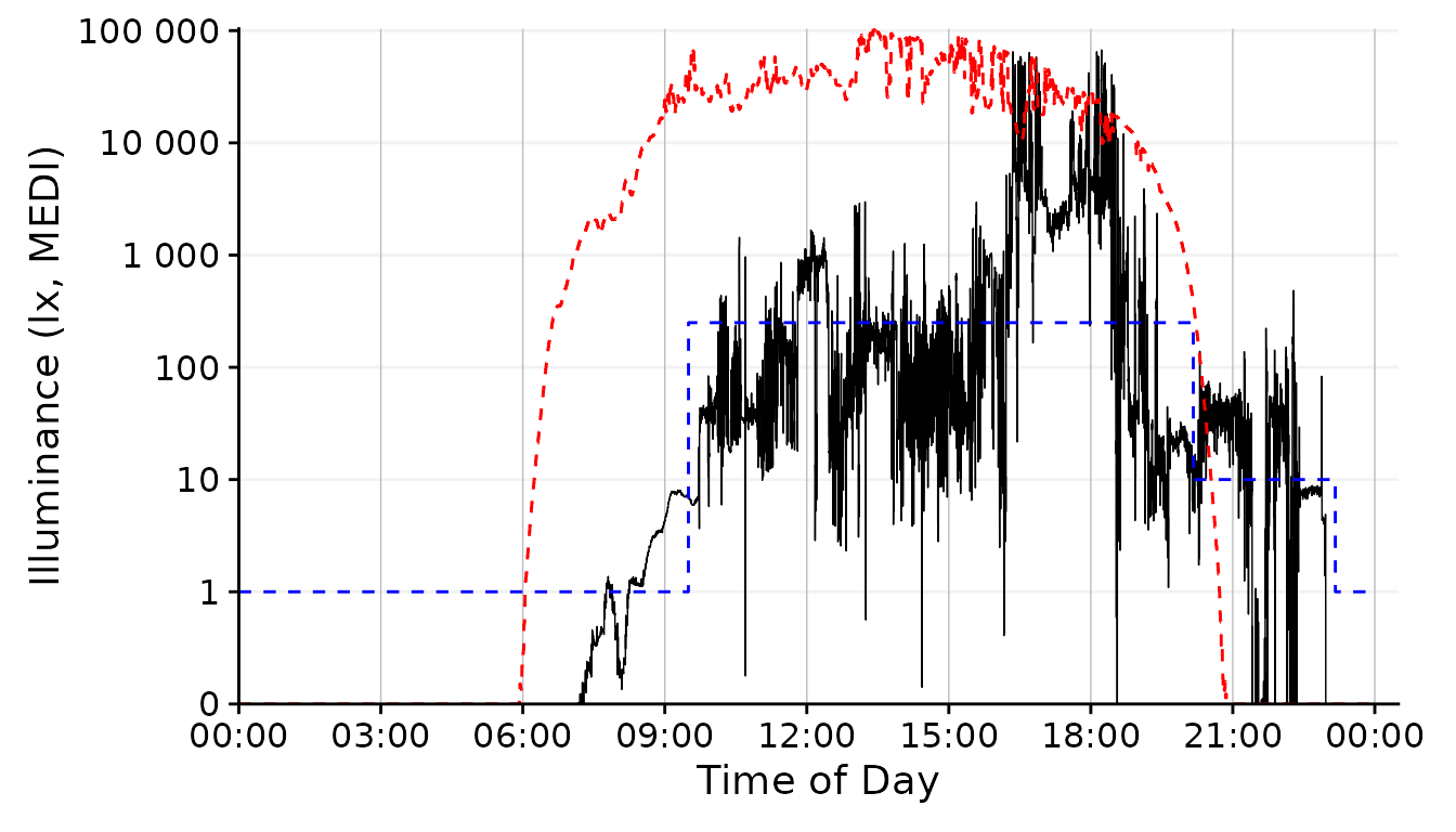
The line geom shows changes in luminous exposure a bit better and might be a better choice in this case.
dataset.LL.partial  |>
  gg_day(facetting = FALSE, geom = "ribbon", alpha = 0.25, size = 0.25,
         fill = "#EFC000", color = "#EFC000") + #base plot
  solar.reference +
  brown.reference +
  scale.correction
The geom_area fills an area from 0 up to the given
value. For some reason, however, this is very slow and unfortunately
doesn´t work nicely with purely logarithmic plots (where 10^0 = 1, so it
would start at 13). We can, however, disable any geom in
gg_day() with geom = "blank" and instead add a
geom_ribbon that can be force-based to zero with
ymin = 0. Setting geom = "ribbon" does this
automatically behind the scenes and is very fast.
dataset.LL.partial  |>
  cut_Datetime(unit = "30 minutes") |> #provide an interval for the boxplot
  gg_day(size = 0.25, facetting = FALSE, geom = "boxplot", group = Datetime.rounded) + #base plot
  solar.reference +
  brown.reference +
  scale.correction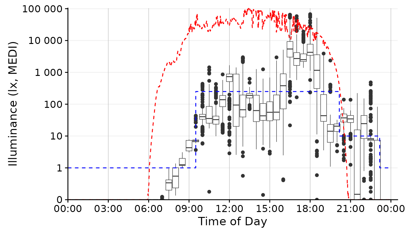
To create a boxplot representation, we not only need to specify the
geom but also what time interval we want the boxplot to span. Here the
cut_Datetime() function from LightLogR
comes to the rescue. It will round the datetimes to the desired
interval, which then can be specified as the group argument
of gg_day(). While this can be a nice representation, I
don´t think it fits our goal for the overall figure in our specific
case.
dataset.LL.partial  |>
  gg_day(
    size = 0.25, facetting = FALSE, geom = "bin2d",
    jco_color = FALSE, bins = 24, aes_fill = stat(count)) + #base plot
  solar.reference +
  brown.reference +
  scale.correction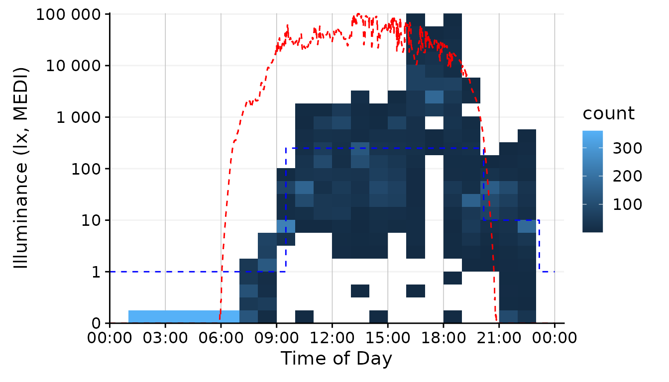
The geom family of hex, bin2d, or
density_2d is particularly well suited if you have many,
possibly overlaying observations. It reduces complexity by cutting the
x- and y-axis into bins and counts how many observations fall within
this bin. By choosing 24 bins, we see dominant values for every hour of
the day. The jco_color = FALSE argument is necessary to
disable the default discrete color scheme of gg_day(),
because a continuous scale is necessary for counts or densities.
Finally, we have to use the aes_fill = stat(count) argument
to color the bins according to the number of observations in the bin4.
Conclusion: The line or
ribbon geom seem like a good choice for our task. However,
The high resolution of the data (10 seconds) makes the line
very noisy. Sometimes this level of detail is good, but our figure
should give more of a general representation of luminous exposure, so we
should aggregate the data somewhat. We can use a similar function as for
the boxplot, aggregate_Datetime() and use this to aggregate
our data to the desired resolution. It has sensible defaults to handle
numeric (mean), logical and character (most represented) data, that can
be adjusted. For the sake of this example, let´s wrap the aggregate
function with some additional code to recalculate the
Brown_recommendations, because while the default numeric
aggregation is fine for measurement data, it does not make sense for the
Brown_recommendations column.
aggregate_Datetime2 <- function(...) {
  aggregate_Datetime(...) |> #aggregate the data
  select(-Reference.Brown) |> #remove the rounded
  Brown2reference(Brown.rec.colname = Reference.Brown) #recalculate the brown times
    }
Data aggregation
With the new aggregate function, let us taste some variants:
dataset.LL.partial  |>
  gg_day(facetting = FALSE, geom = "ribbon", alpha = 0.25, size = 0.25,
         fill = "#EFC000", color = "#EFC000") + #base plot
  solar.reference +
  brown.reference +
  scale.correction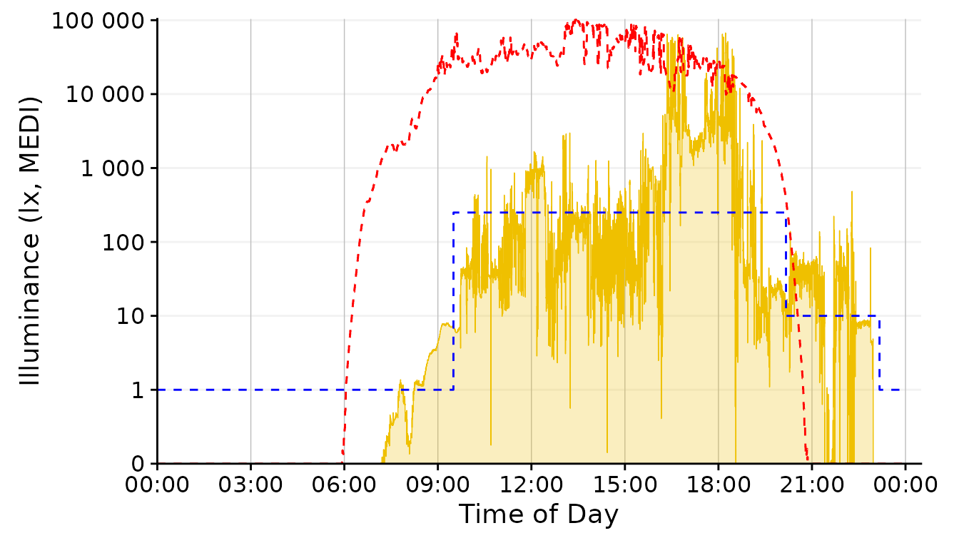
dataset.LL.partial |>
  aggregate_Datetime2(unit = "1 min")  |>
  gg_day(facetting = FALSE, geom = "ribbon", alpha = 0.25, size = 0.25,
         fill = "#EFC000", color = "#EFC000") + #base plot
  solar.reference +
  brown.reference +
  scale.correction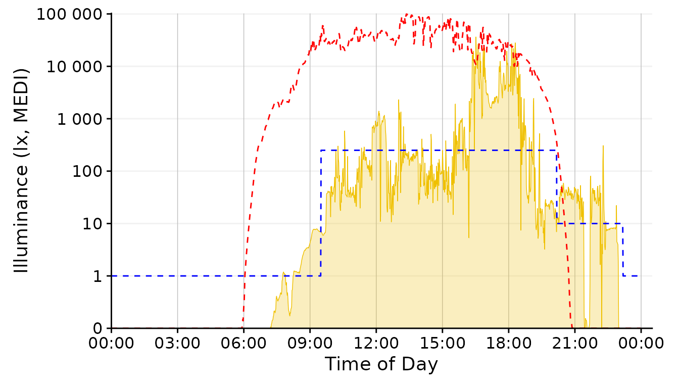
dataset.LL.partial |>
  aggregate_Datetime2(unit = "5 mins")  |>
  gg_day(facetting = FALSE, geom = "ribbon", alpha = 0.25, size = 0.25,
         fill = "#EFC000", color = "#EFC000") + #base plot
  solar.reference +
  brown.reference +
  scale.correction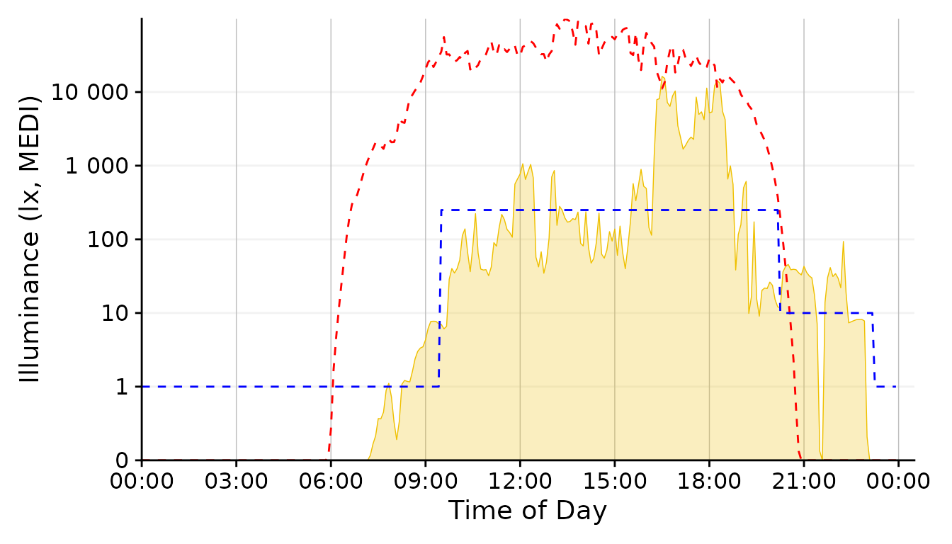
dataset.LL.partial |>
  aggregate_Datetime2(unit = "30 mins") |>
  gg_day(facetting = FALSE, geom = "ribbon", alpha = 0.25, size = 0.25,
         fill = "#EFC000", color = "#EFC000") + #base plot
  solar.reference +
  brown.reference +
  scale.correction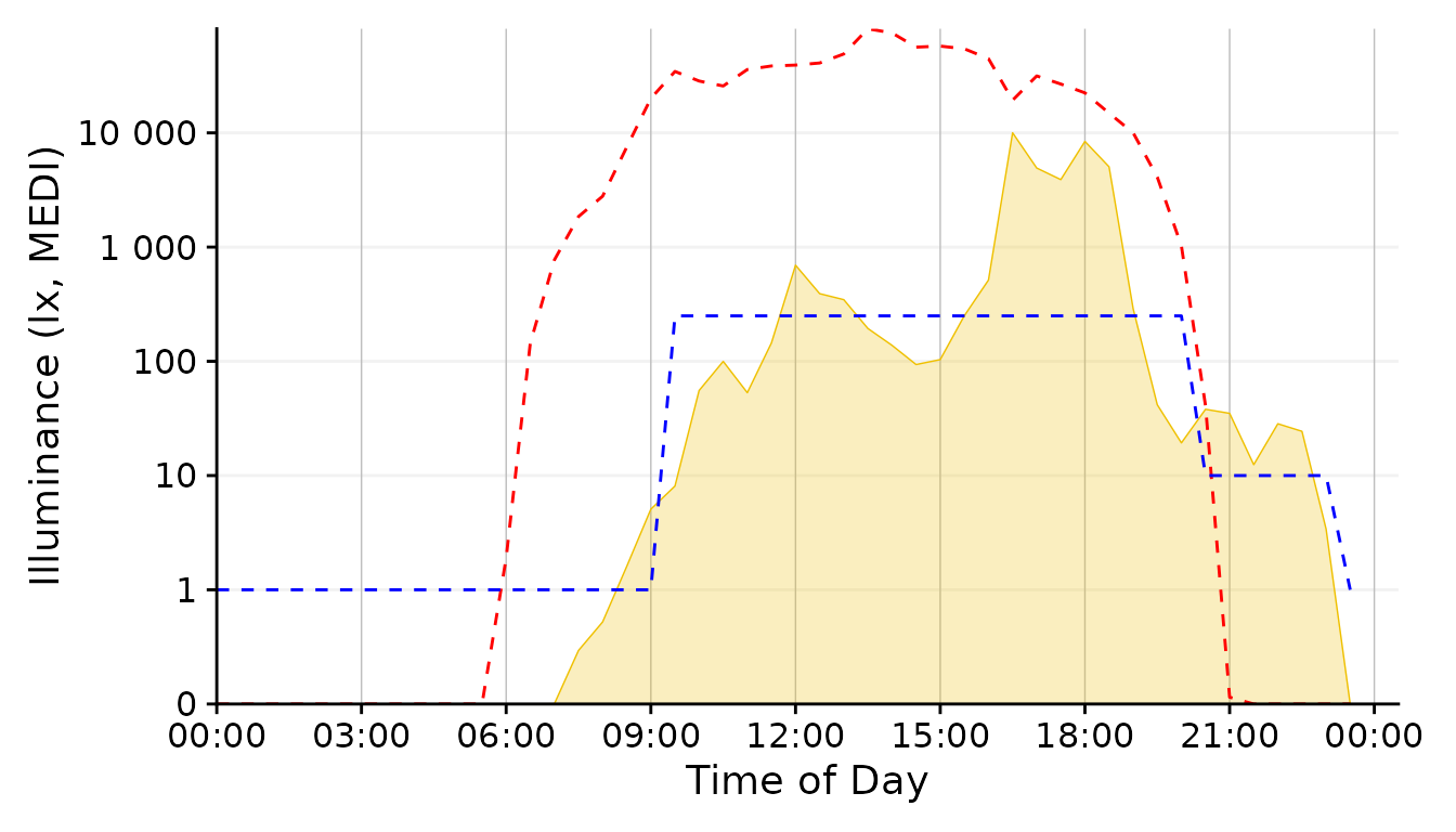
dataset.LL.partial |>
  aggregate_Datetime2(unit = "1 hour")  |>
  gg_day(facetting = FALSE, geom = "ribbon", alpha = 0.25, size = 0.25,
         fill = "#EFC000", color = "#EFC000") + #base plot
  solar.reference +
  brown.reference +
  scale.correction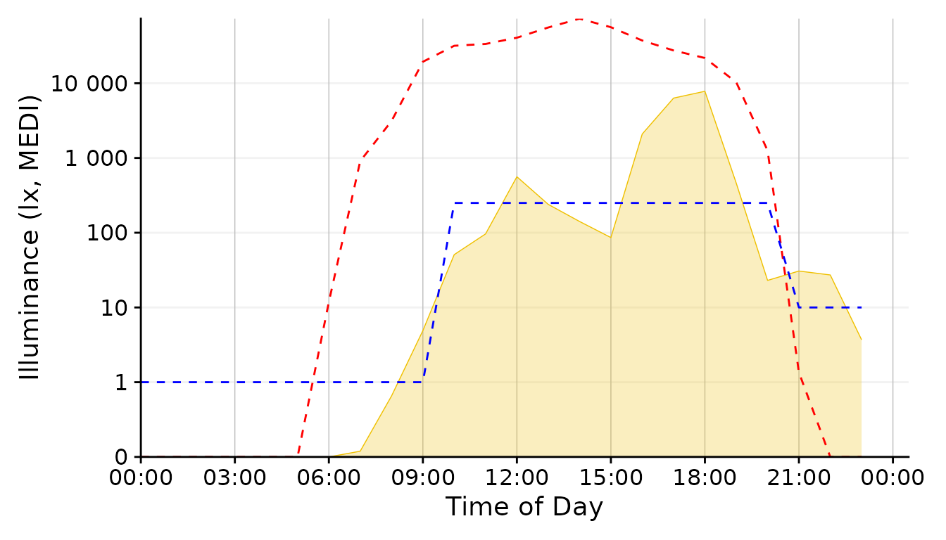
Conclusion: The 1 minute aggregate still is pretty noisy, whereas the 30 minutes and 1 hour steps are to rough. 5 Minutes seem a good balance.
Plot <-
dataset.LL.partial |>
  aggregate_Datetime2(unit = "5 mins")  |>
  gg_day(facetting = FALSE, geom = "ribbon", alpha = 0.25, size = 0.25,
         fill = "#EFC000", color = "#EFC000") + #base plot
  brown.reference +
  scale.correction
Solar Potential
Let us focus next on the solar potential that is not harnessed by the participant. We have several choices in how to represent this.

This was our base representation for the solar exposure. And it is not a bad one at that. Let’s keep it in the run for know.
Plot +
  geom_ribbon(aes(ymin = MEDI, ymax=Reference), alpha = 0.25, fill = "#0073C2FF") #solar reference
This is a ribbon that shows the missed - and at night exceeded - potential due to daylight.
#Note: This will become a function of its own in LightLogR at some point in the future

Plot_upper <-
dataset.LL.partial |>
  aggregate_Datetime2(unit = "5 mins") |>
  gg_day(facetting = FALSE, geom = "ribbon", alpha = 0.25, size = 0.4,
         fill = "#EFC000", color = "#EFC000") + #base plot
  geom_line(aes(y=Reference.Brown), lty = 2, col = "red") + #Brown reference
  geom_line(aes(y=Reference), col = "#0073C2FF", size = 0.4) + #solar reference
  labs(x = NULL) +  #remove the x-axis label
  scale.correction

Plot_lower <-
dataset.LL.partial |>
  aggregate_Datetime2(unit = "5 mins") |>
  gg_day(facetting = FALSE, geom = "blank", y.axis.label = "unrealized Potential") + #base plot
  geom_area(
    aes(y = Reference - MEDI,
        group = consecutive_id((Reference - MEDI) >= 0),
        fill = (Reference - MEDI) >= 0,
        col = (Reference - MEDI) >= 0),
    alpha = 0.25, outline.type = "upper") +
  guides(fill = "none", col = "none") +
  geom_hline(aes(yintercept = 0), lty = 2) +
    scale_fill_manual(values = c("#EFC000", "#0073C2")) +
    scale_color_manual(values = c("#EFC000", "#0073C2")) +
  scale.correction
#> Scale for fill is already present.
#> Adding another scale for fill, which will replace the existing scale.
#> Scale for colour is already present.
#> Adding another scale for colour, which will replace the existing scale.

Plot_upper / Plot_lower #set up the two plots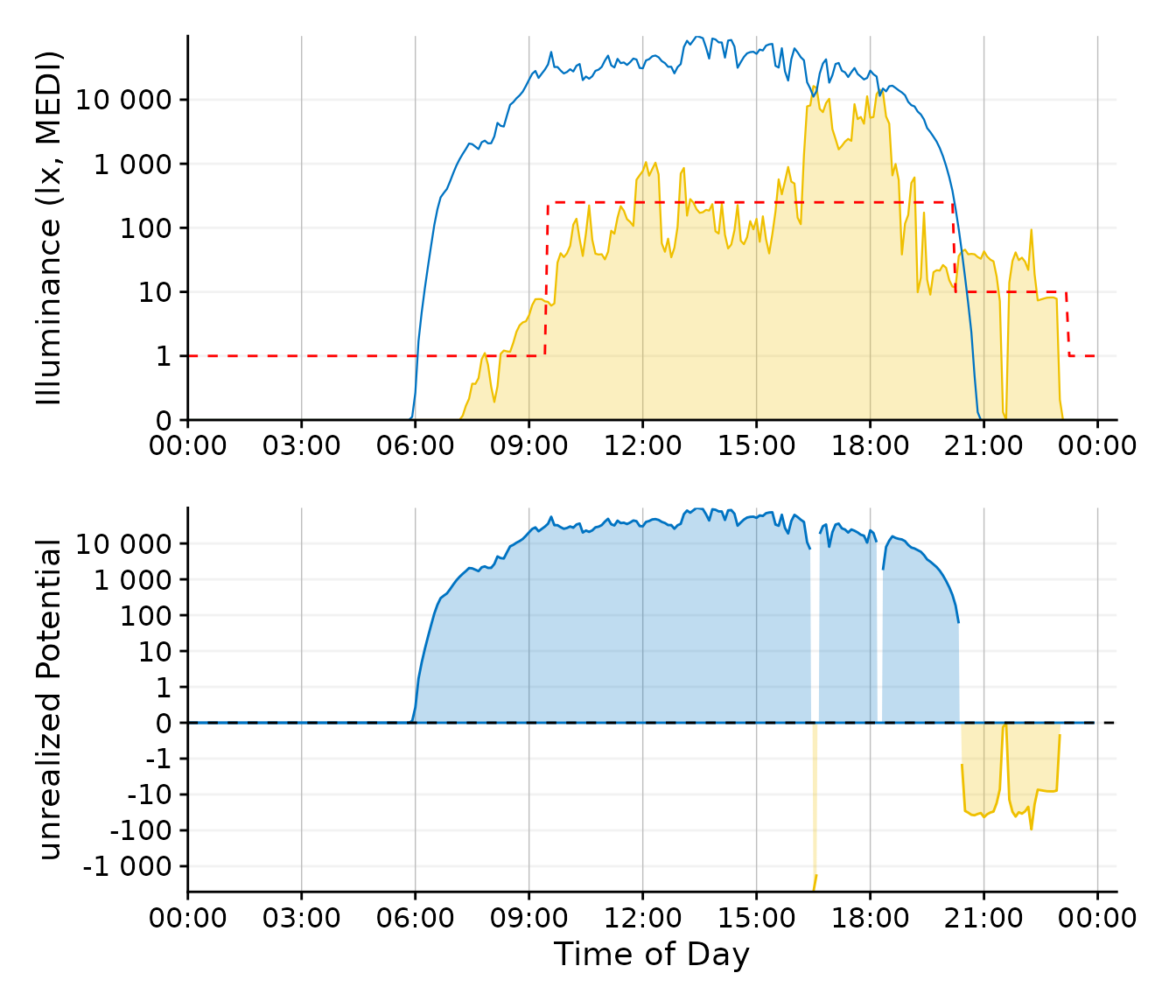
This plot requires a bit of preparation, but it focuses nicely on the unrealized daylight potential. For reasons of clarity, the line color for the Brown recommendation was changed from blue to red.
Conclusion: While the second plot
option is nice, it focuses on one aspect - the missed or unrealized
potential. The geom_ribbon variant still includes this
information, but is more general, which is exactly what we want
here.
Day.end <- as_datetime("2023-09-01 23:59:59", tz = tz)
Plot <-
dataset.LL.partial |>
  aggregate_Datetime2(unit = "5 mins") |>
  filter_Datetime(end = Day.end) |>
  gg_day(facetting = FALSE, geom = "blank", y.axis.breaks = c(0, 10^(0:5), 250)) + #base plot
    geom_ribbon(aes(ymin = MEDI, ymax=Reference),
              alpha = 0.25, fill = "#0073C2FF",
              outline.type = "upper", col = "#0073C2FF", size = 0.15) + #solar reference
  geom_ribbon(aes(ymin = 0, ymax = MEDI), alpha = 0.30, fill = "#EFC000",
              outline.type = "upper", col = "#EFC000", size = 0.4) + #ribbon geom
  scale.correction
Brown Recommendations
The Brown recommendations add a layer of complexity, as they specify
a threshold that should not be reached or that should be exceeded,
depending on the time of day. We can tackle this aspect in several ways.
In any case, the y-axis should reflect the datime threshhold value of
250 lx. This is already considered through the
y.axis.breaks argument in the code chunk above.
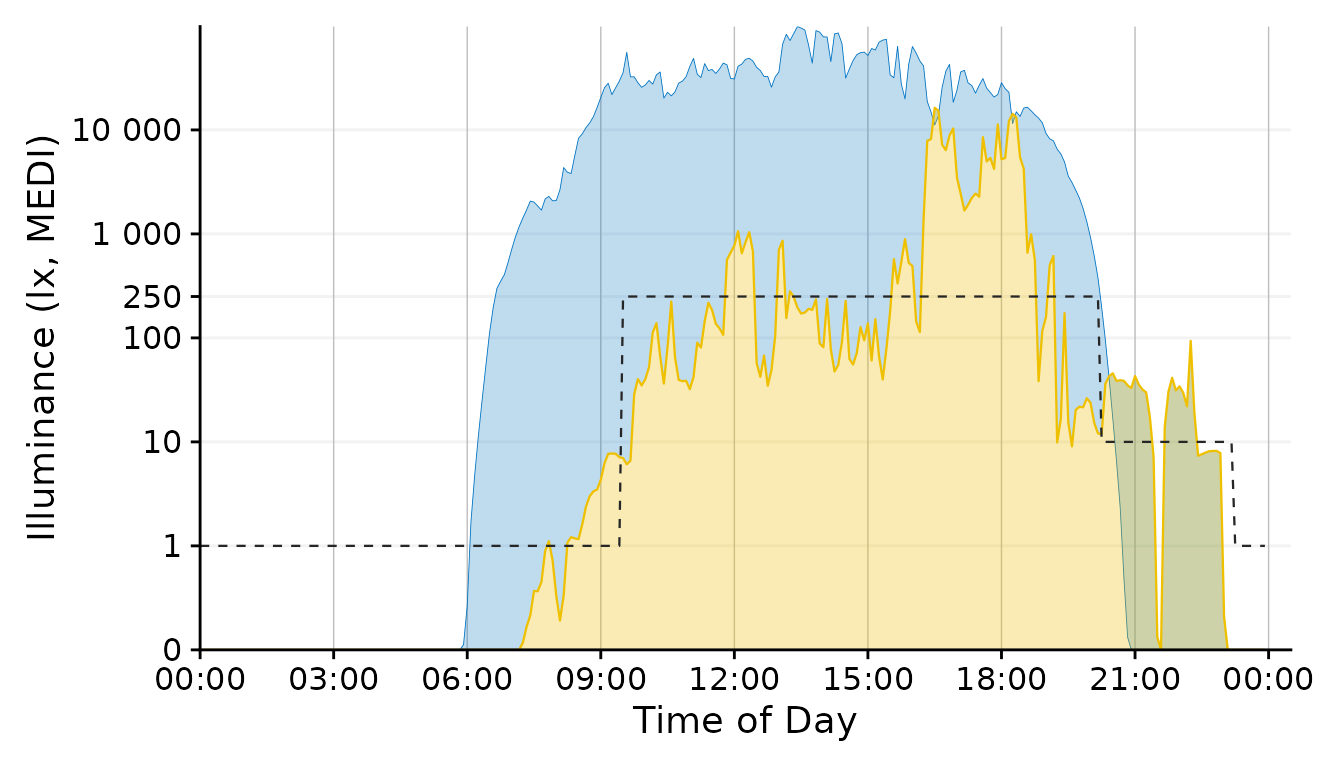
This is a variant of the representation used throught the document. Since the luminous exposure and daylight levels are very distinct in terms of color, however, the line could stay black.
#This section will be integrated into a LightLogR function in the future
Day.start <- as_datetime("2023-09-01 00:00:00", tz = tz)
Day.end <- as_datetime("2023-09-01 23:59:59", tz = tz)
Interval <- lubridate::interval(start = Day.start, end = Day.end, tzone = tz)
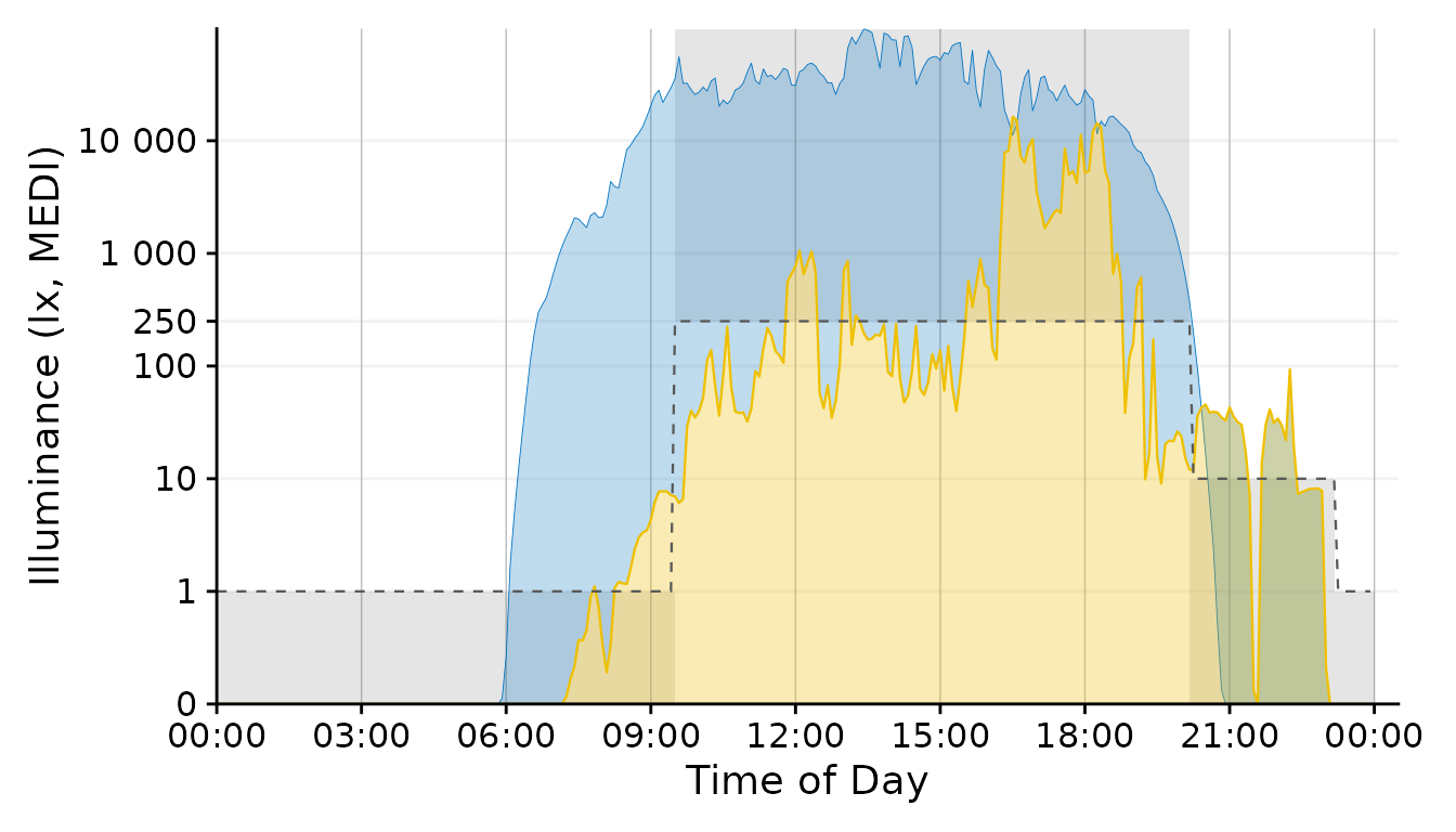
Brown.times <-
Brown.intervals |>
filter(Interval |> int_overlaps(.env$Interval)) |>
mutate(ymin = case_match(State.Brown,
"night" ~ 0,
"day" ~ 250,
"evening" ~ 0),
ymax = case_match(State.Brown,
"night" ~ 1,
"day" ~ Inf,
"evening" ~ 10),
xmin = int_start(Interval),
xmax = int_end(Interval),
xmin = if_else(xmin < Day.start, Day.start, xmin) |> hms::as_hms(),
xmax = if_else(xmax > Day.end, Day.end, xmax) |> hms::as_hms()
)
recommendations <-
geom_rect(
data = Brown.times,
aes(xmin= xmin, xmax = xmax, ymin = ymin, ymax = ymax),
inherit.aes = FALSE,
alpha = 0.15,
fill = "grey35")
Plot2 <- Plot
Plot2$layers <- c(recommendations, Plot2$layers)
Plot2 
With the geom_area function we can draw target areas for
our values.
Plot +
  geom_point(aes(col = Reference.Brown.check), size = 0.5)+
  geom_line(aes(y=Reference.Brown), lty = 2, size = 0.4, col = "grey60") + #Brown reference
  scale_color_manual(values = c("grey50", "#EFC000"))+
  guides(color = "none")
#> Scale for colour is already present.
#> Adding another scale for colour, which will replace the existing scale.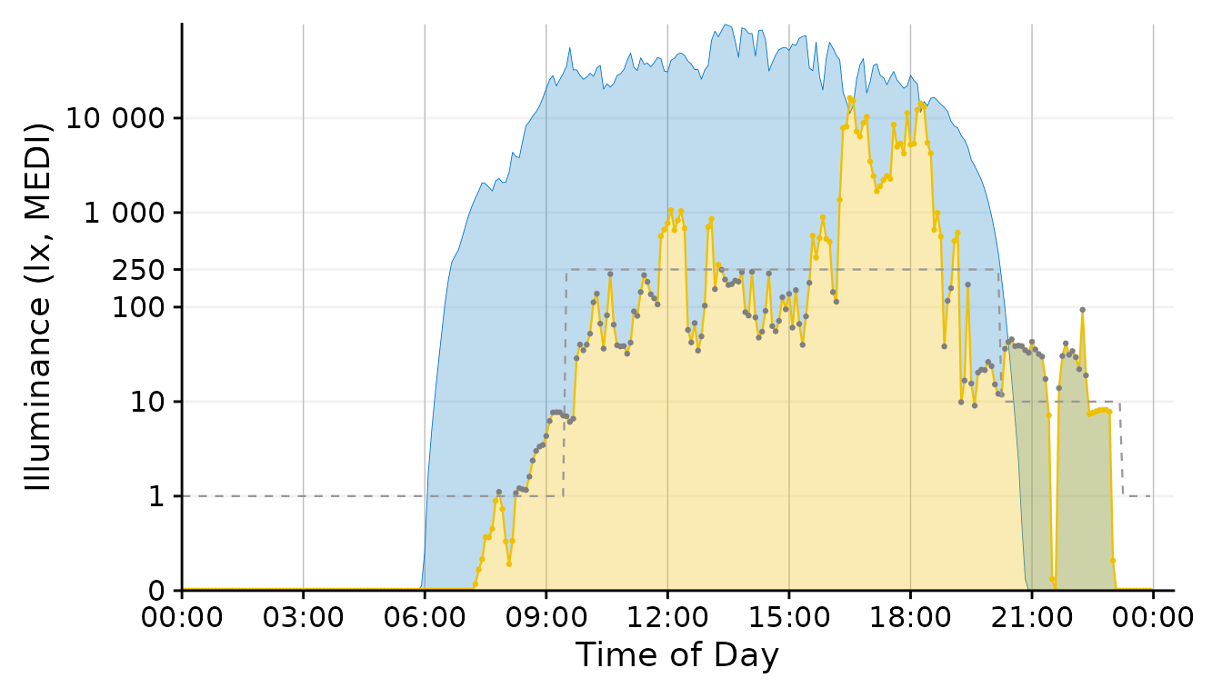
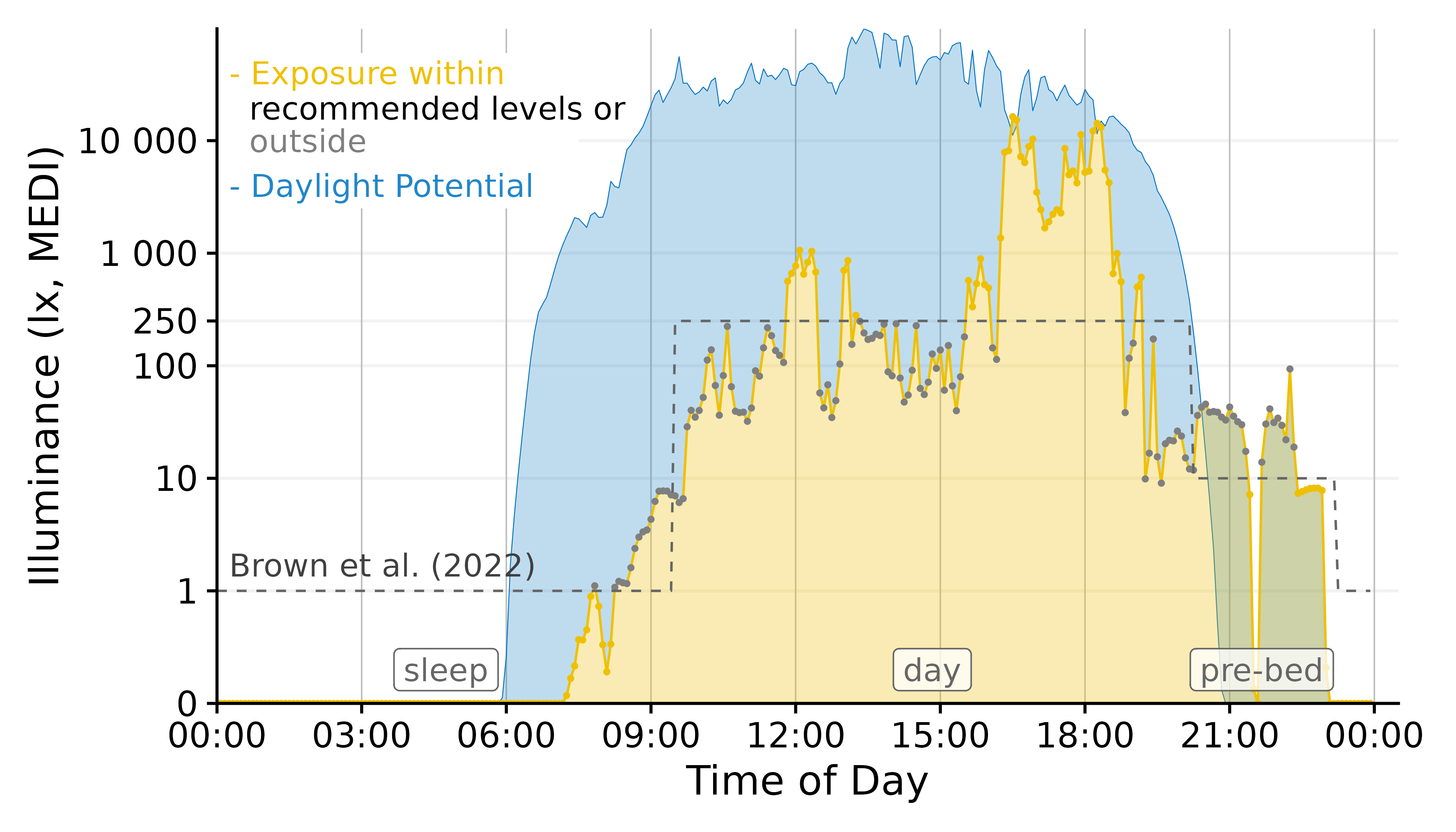
This approach uses a conditional coloration of points, depending on whether or not the personal luminous exposure is within the recommended limits.
Conclusion: The geom_point solution
combines a lot of information in a designwise slim figure that only uses
two colors (+grey) to get many points across.
Plot <-
Plot +
  geom_point(aes(col = Reference.Brown.check), size = 0.5)+
  geom_line(aes(y=Reference.Brown,
                # group = consecutive_id(State.Brown)
                ),
            col = "grey40",
            lty = 2, size = 0.4) + #Brown reference
  scale_color_manual(values = c("grey50", "#EFC000"))+
  guides(color = "none")
Final Touches
Our figure needs some final touches before we can use it, namely
labels. Automatic guides and labels work well when we use color
palettes. Here, we mostly specified the coloring ourselves. Thus we
disabled automatic guides. Instead we will solve this trough
annotations.
x <- 900

Brown.times <-
  Brown.times |>
  mutate(xmean = (xmax - xmin)/2 + xmin,
         label.Brown = case_match(State.Brown,
                                  "night" ~ "sleep",
                                  "evening" ~ "pre-bed",
                                  .default = State.Brown))

Plot +
  # geom_vline(data = Brown.times[-1,],
  #            aes(xintercept = xmin), lty = 2, col = "grey40", size = 0.4) + #adding vertical lines
  geom_label(data = Brown.times[-4,],
             aes(x = xmean, y = 0.3, label = label.Brown),
             col = "grey40", alpha = 0.75) + #adding labels
  annotate("rect", fill = "white", xmin = 0, xmax = 7.5*60*60,
           ymin = 2500, ymax = 60000)+
  annotate("text", x=x, y = 1.7, label = "Brown et al. (2022)",
           hjust = 0, col = "grey25")+
  annotate("text", x=x, y = 40000, label = "- Exposure within",
           hjust = 0, col = "#EFC000")+
  annotate("text", x=x, y = 19500, label = "  recommended levels or",
           hjust = 0, col = "black")+
  annotate("text", x=x, y = 10000, label = "  outside",
           hjust = 0, col = "grey50")+
  annotate("text", x=x, y = 4000, label = "- Daylight Potential",
           hjust = 0, col = "#0073C2DD")
#create folder images if necessary
if (!dir.exists("images")) dir.create("images")
#save image
ggplot2::ggsave("images/Day.png", width = 7, height = 4, dpi = 600)
This concludes our task. We have gone from importing multiple source
files to a final figure that is ready to be used in a publication.
LightLogR facilitated the importing and processing
steps in between and also enabled us to test various decisions, like the
choice of geom or time.aggregation.